
WineVibes
Find your wine, not a feature list.
Find your wine, not a feature list.
WineVibes is a mobile app for people who actually enjoy wine. Not sommeliers, not learners chasing tasting-note vocabulary: the person who wants a bottle that fits the mood they're already in.
The primary user goal isn't learn about wine. It's get to the right bottle in under a minute, with confidence. Every design decision had to serve that goal, or get out of the way.
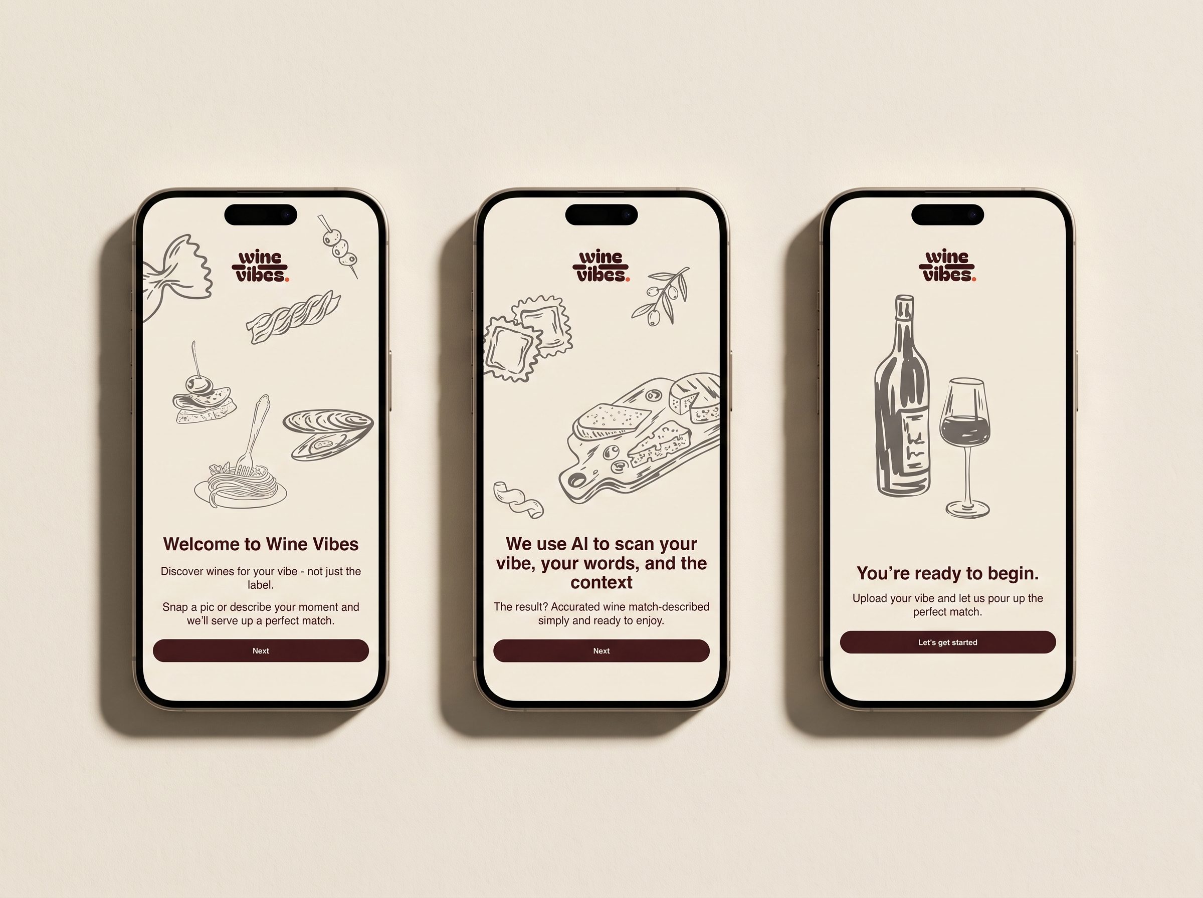
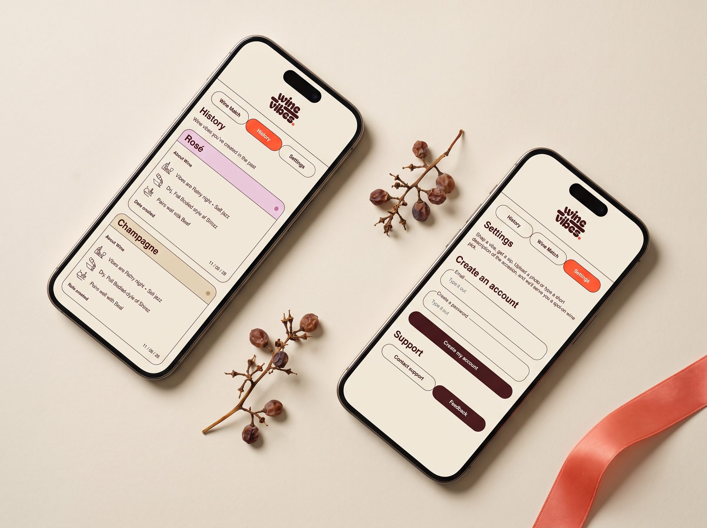
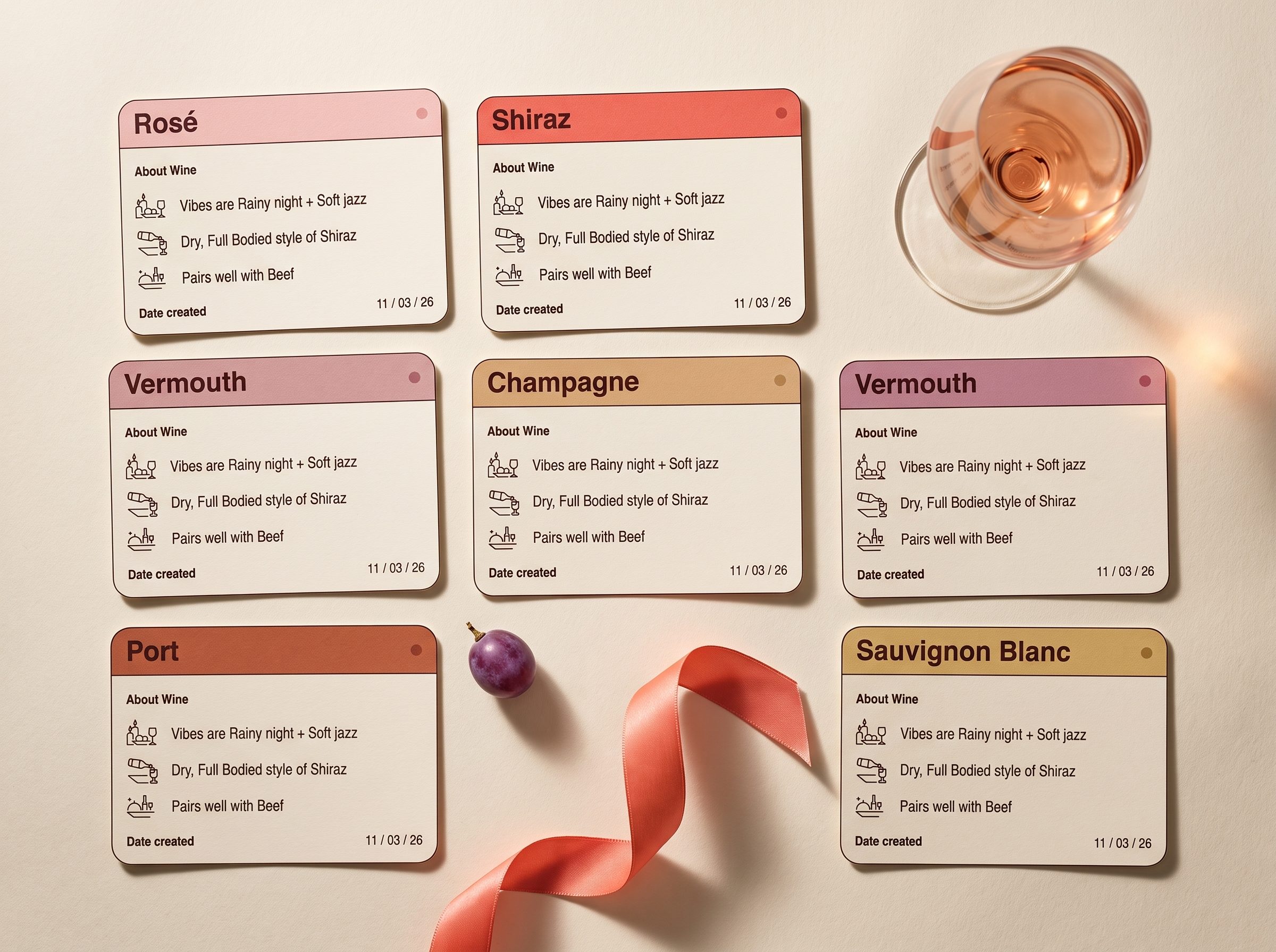
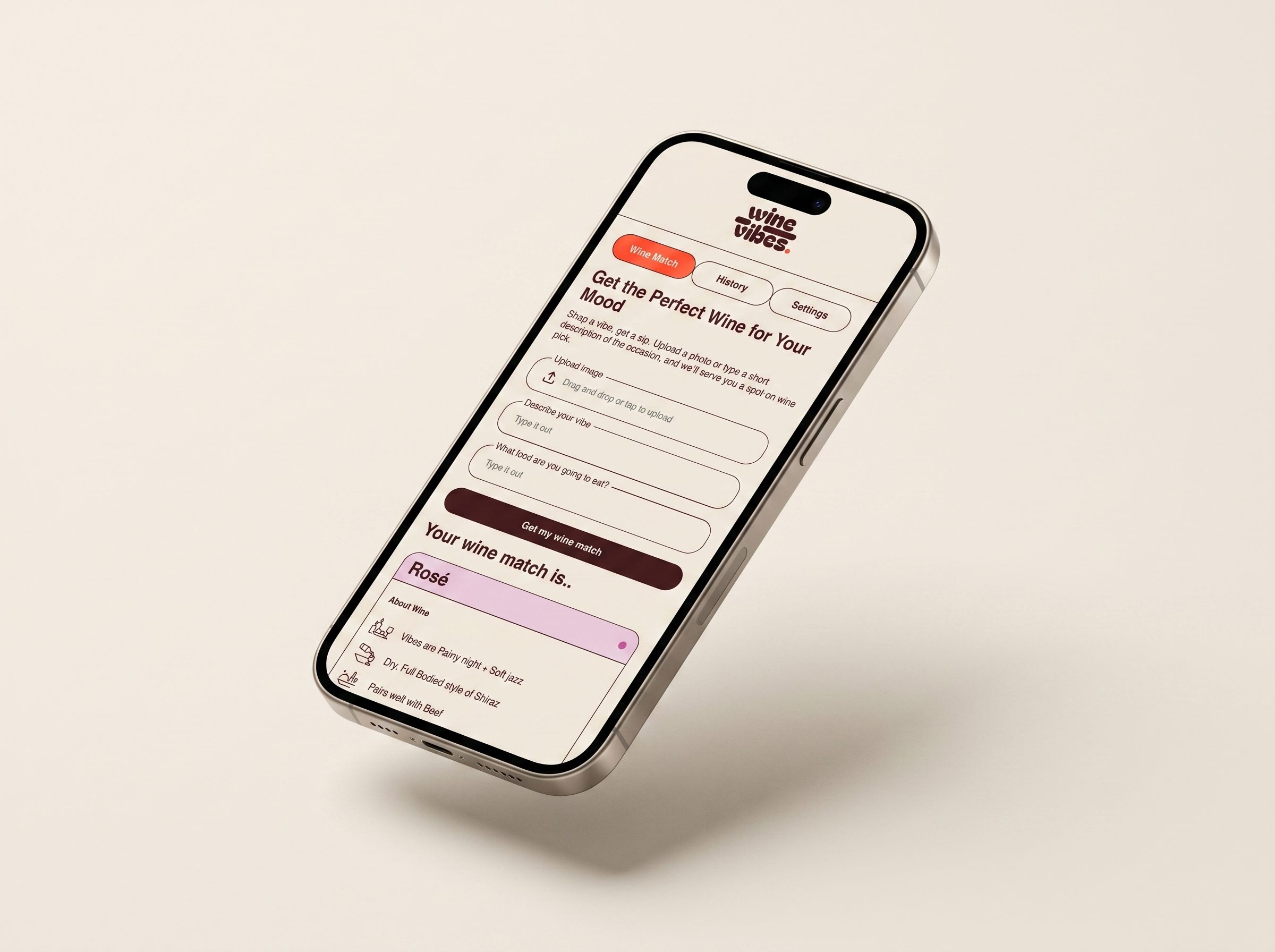
I gave myself one non-negotiable rule before I sketched a screen: the entire app had to live in three pages. That constraint wasn't aesthetic; it was protective.
Wine apps have a tendency to bloat. Every feature (social feed, virtual cellar, food pairings, vintage database, barcode scanner) sounds useful in isolation and adds friction in aggregate. Users open the app to make a decision, not to browse a catalog. Every additional feature is a small cognitive tax on the moment they came to solve.
Three pages meant I couldn't hide behind features. It also meant the user could learn the entire app in about ten seconds, which matters when you're designing for someone who came to feel empowered, not schooled.
Each cut was a bet on the primary user's goal. No social feed. No virtual cellar. No sommelier-grade tasting notes nobody finishes. No barcode scanner. No "people you might also follow." I held every proposed feature against one question: does this shorten the distance between "I don't know what to drink" and "I'm getting this one", or does it sit between the user and the result?
The three pages became: match your vibe, review your history, adjust your preferences. That was the entire product. The rest of the work was refinement (button size, form field order, the language of the vibe prompts) because when you strip a product this bare, the small typography and micro-copy decisions do the heavy lifting.
The work was in deciding what wasn't there.
The visual identity had to feel like the wine aisle of a small, considered bottle shop, not the fluorescent supermarket version. Warm cream backdrop. Deep burgundy for the primary CTA. A soft rose accent for the match reveal. The wordmark sits in a rounded warm serif because the app itself is casual, not clinical. Nothing about the language says expert or system. Everything says friend who knows their bottles.
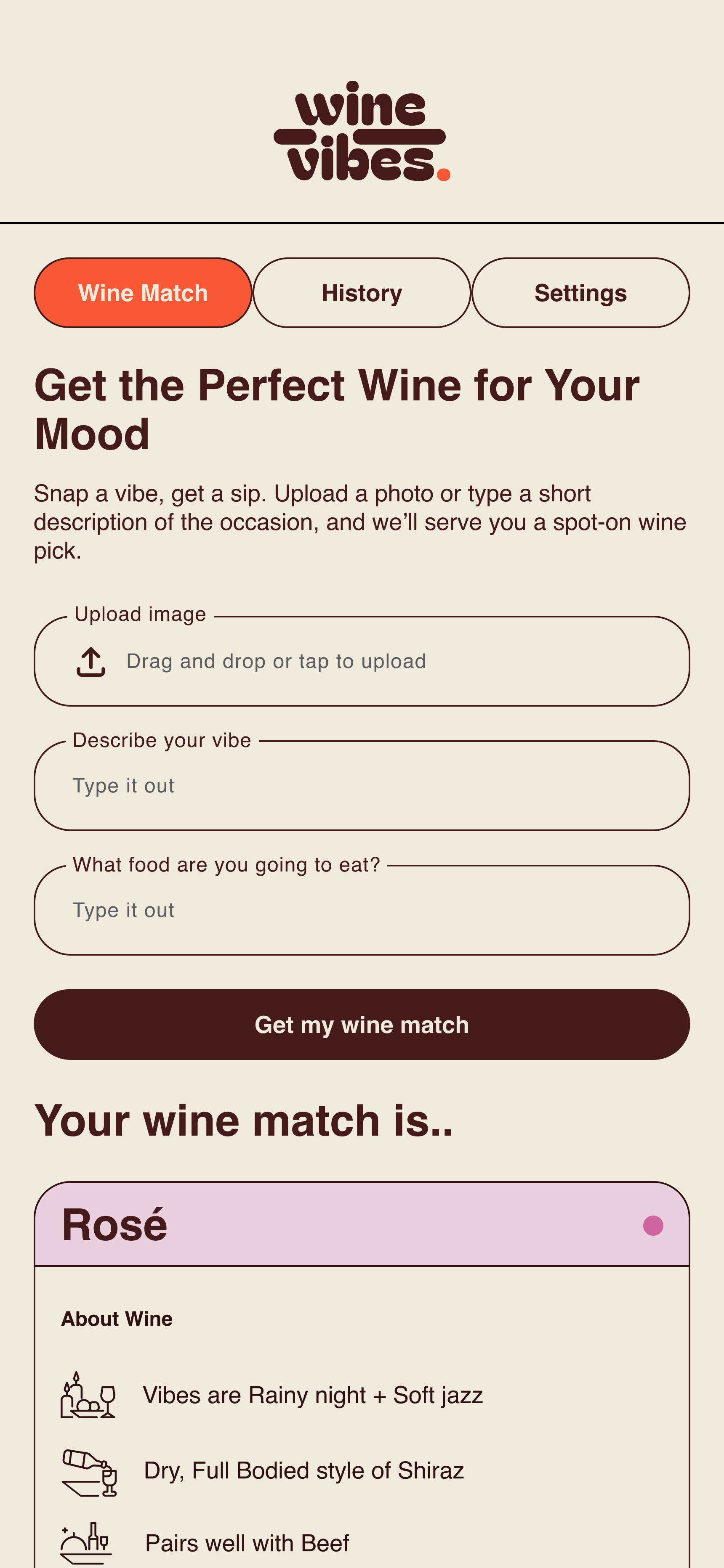
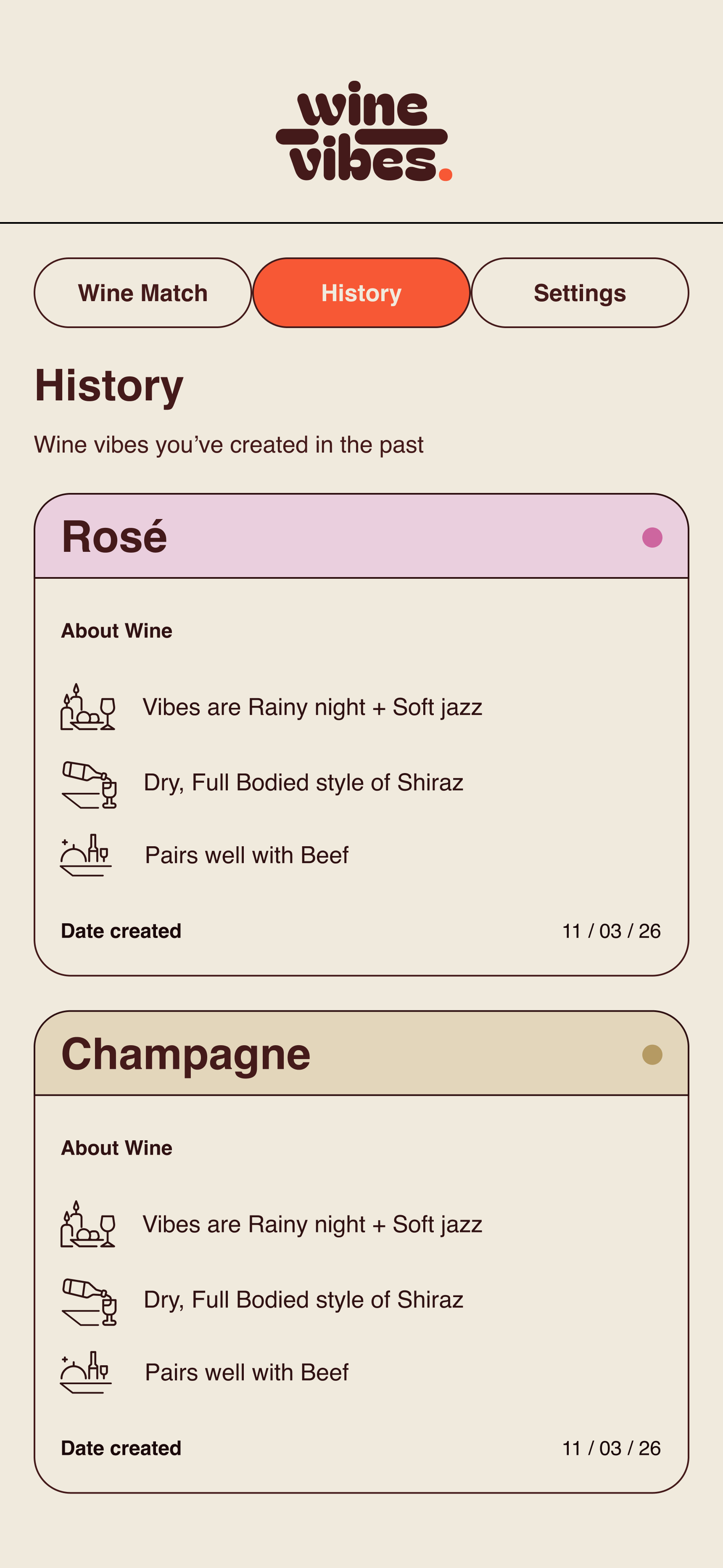
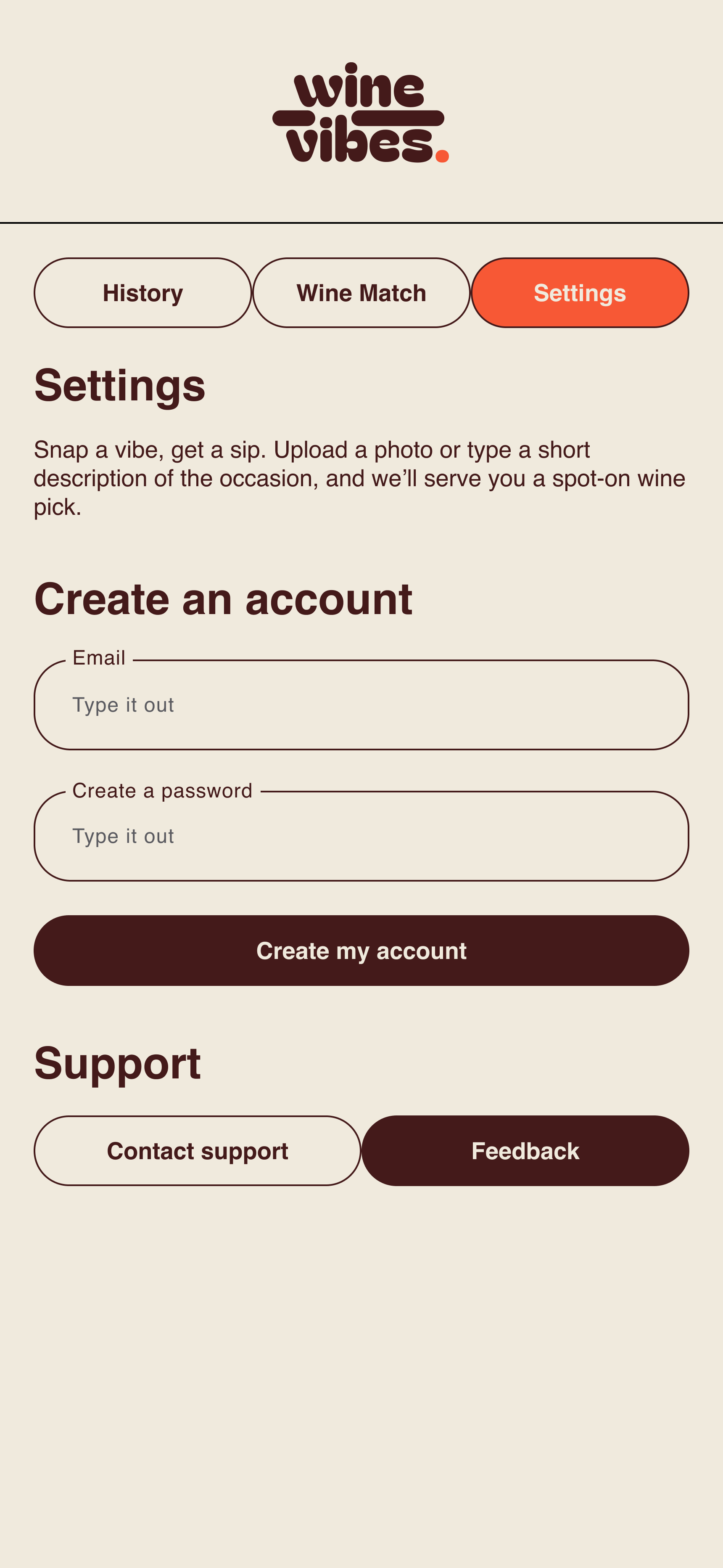
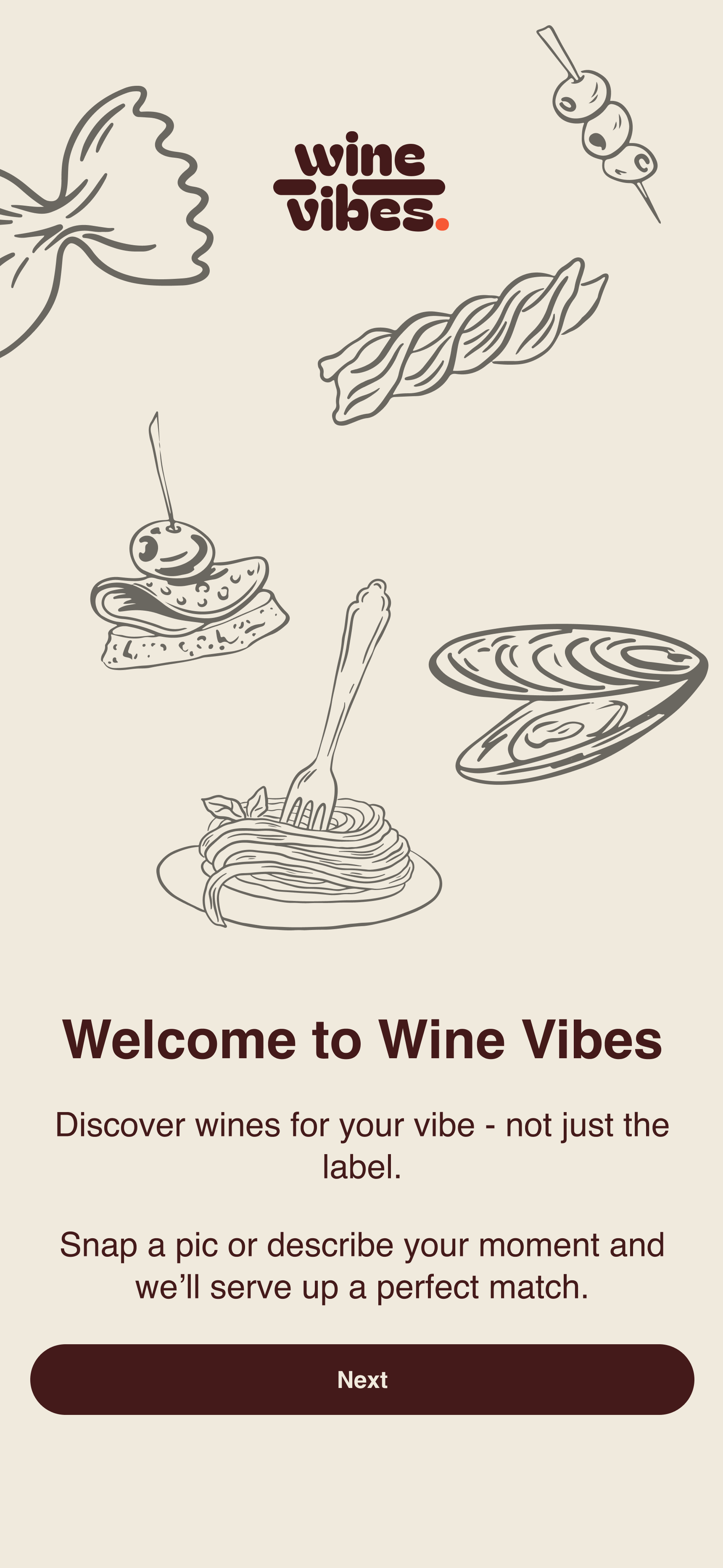
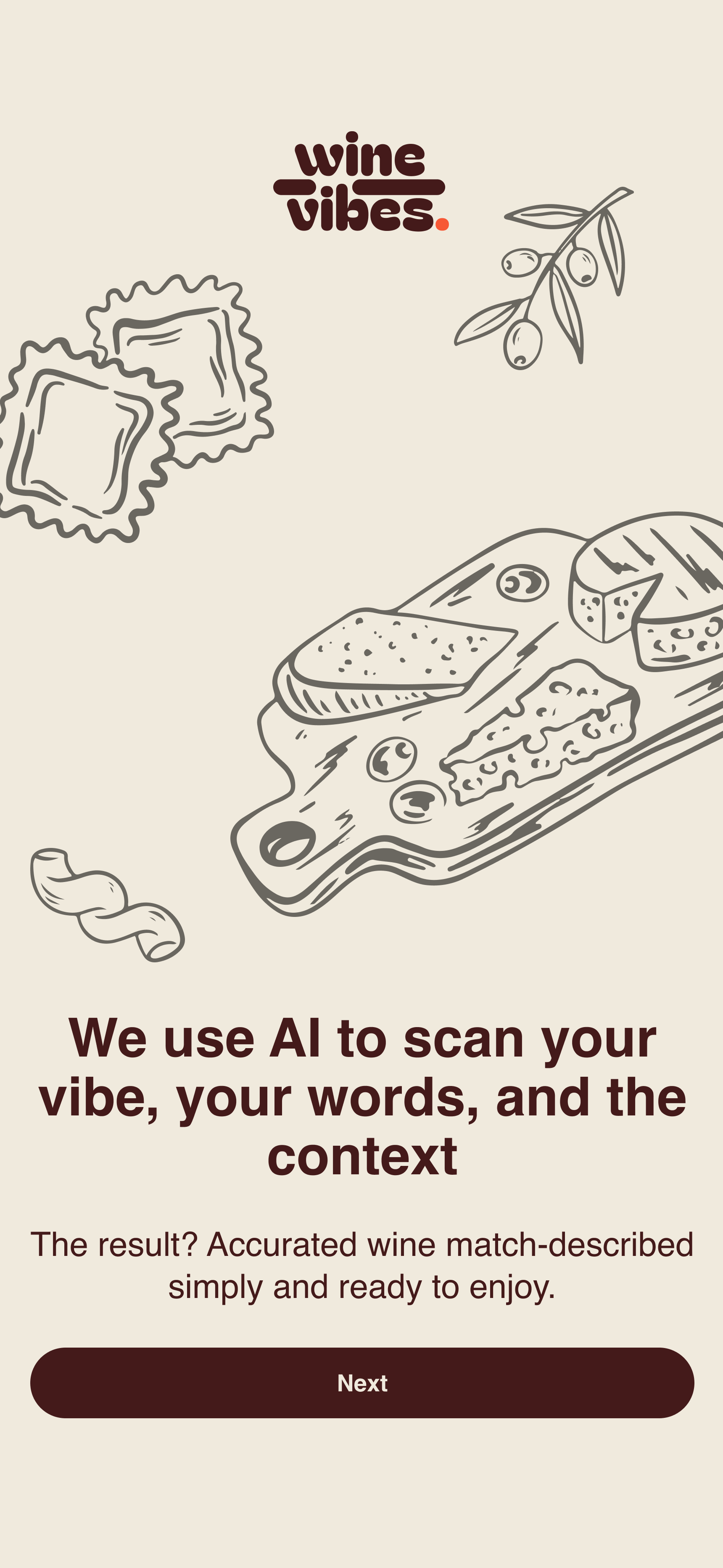
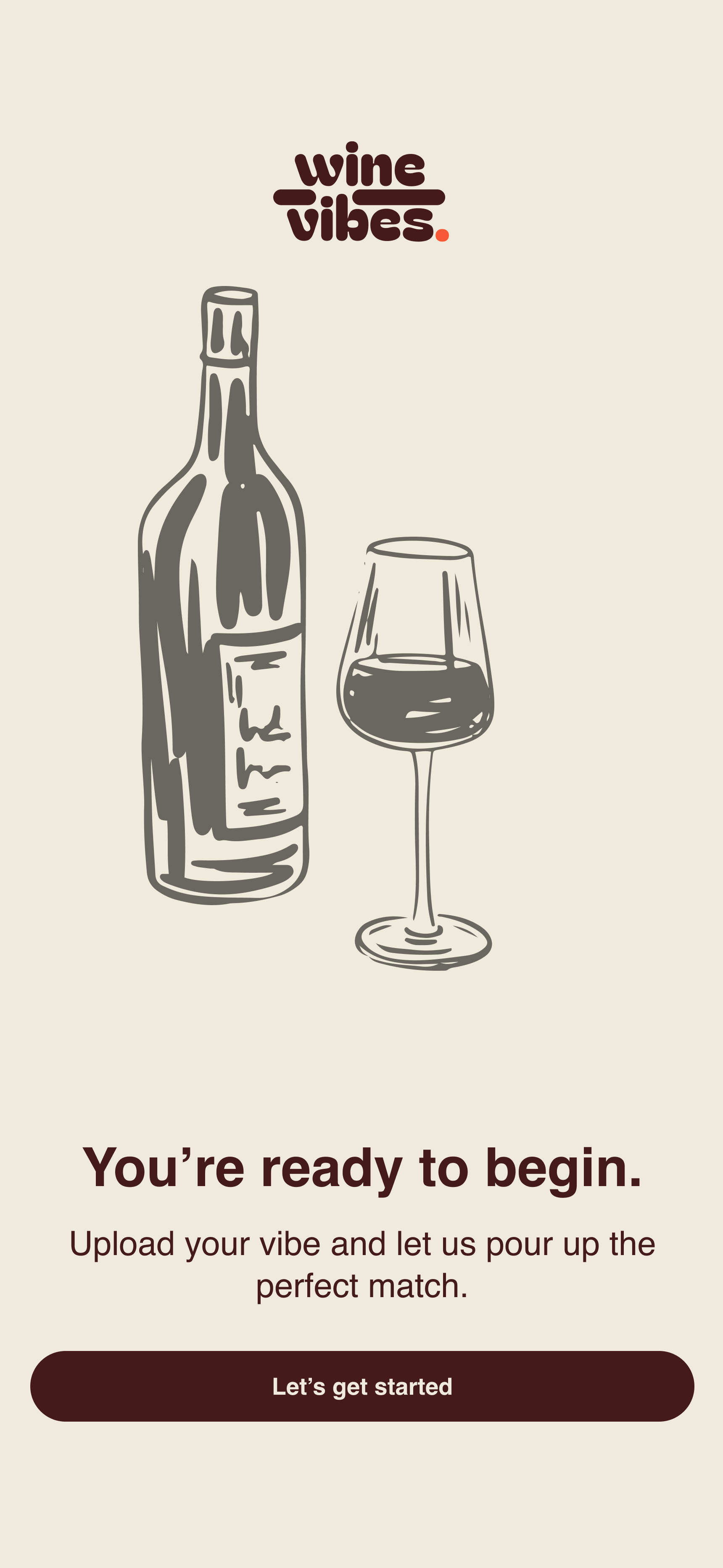
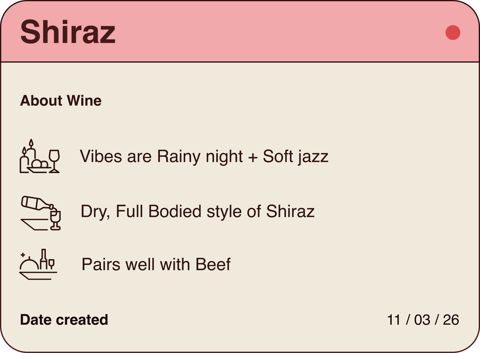
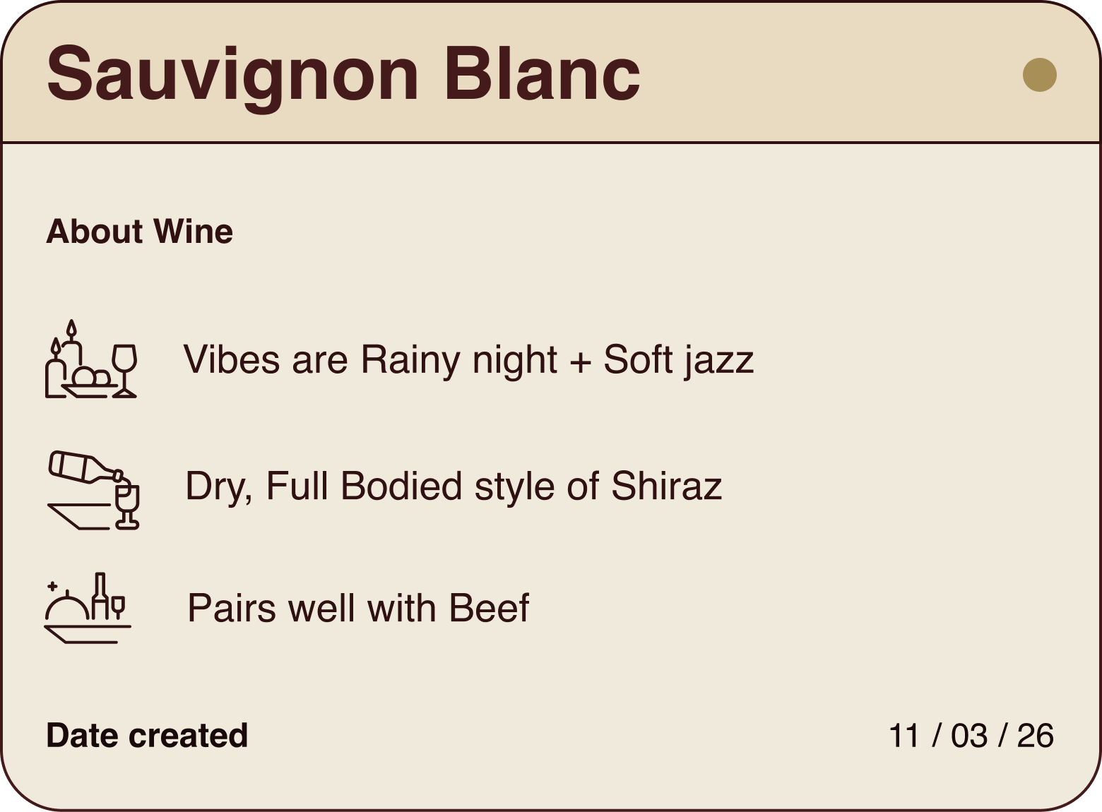
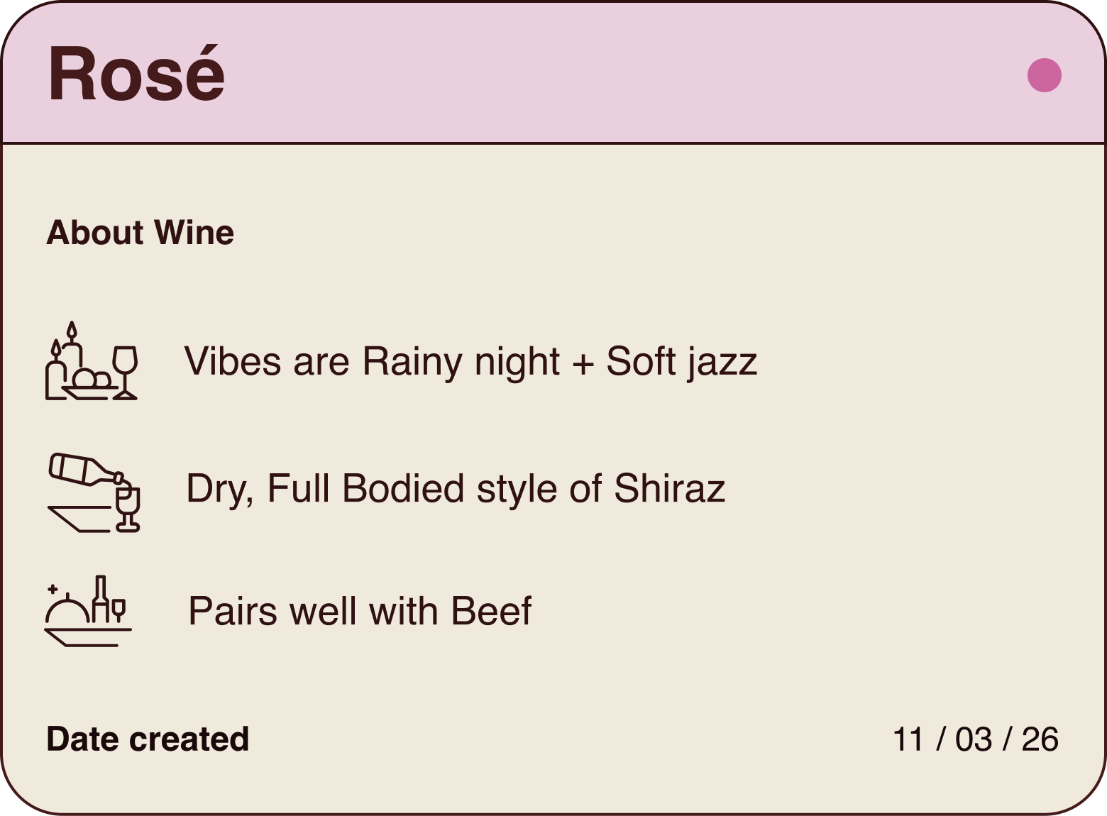
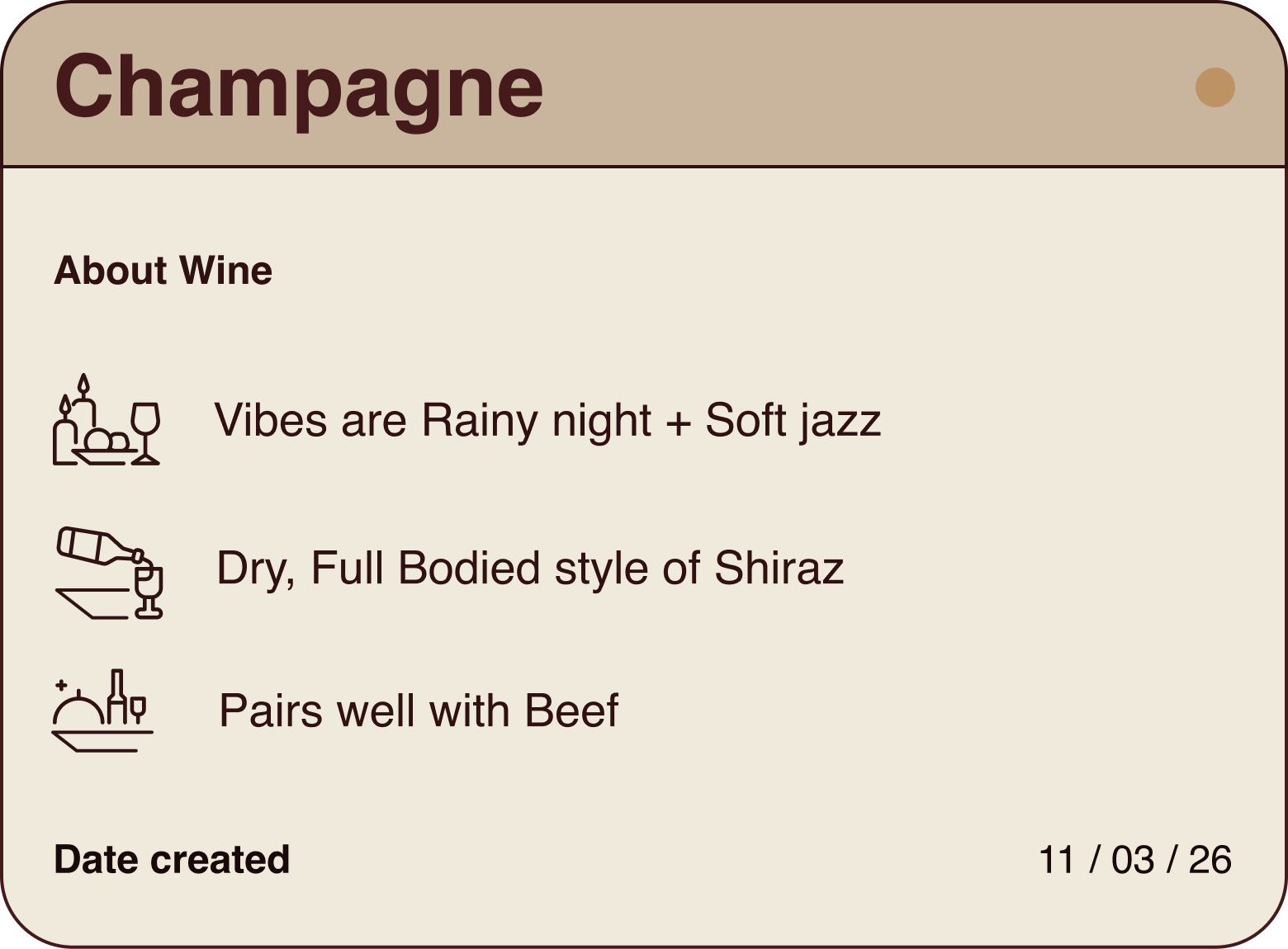

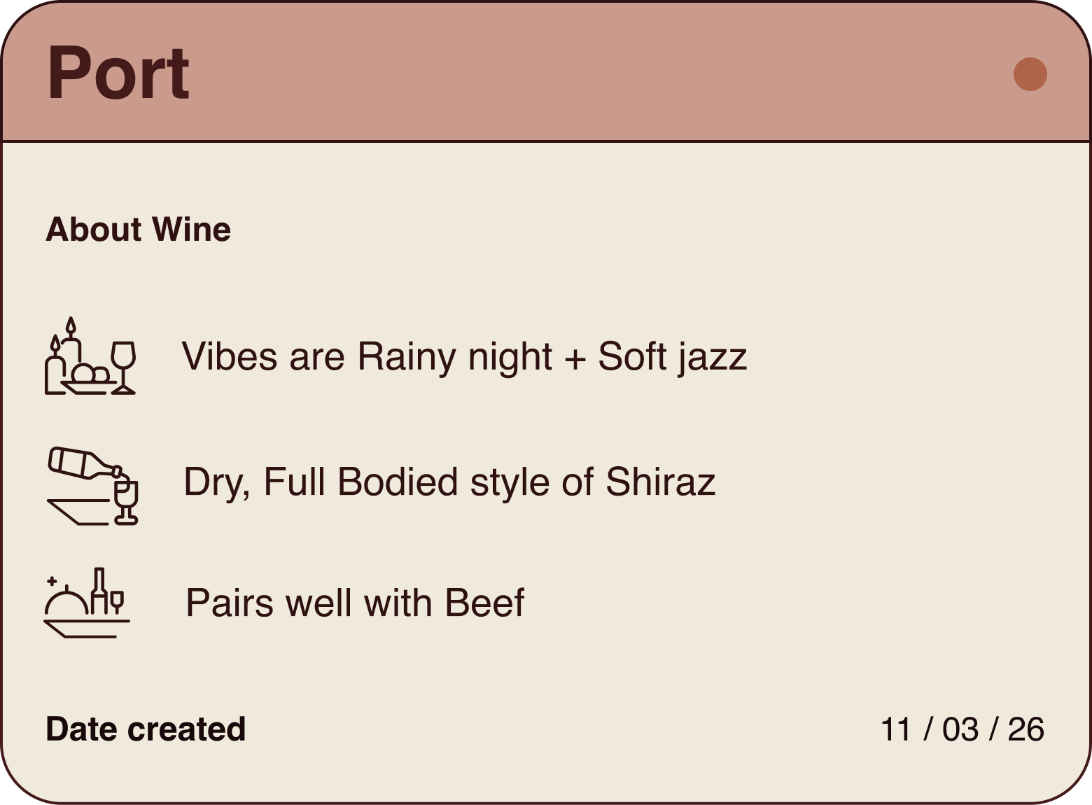
Fifteen seconds from I don't know what to drink to I'm getting this. Users don't notice the design when they use it, which is exactly what a goal-directed tool should look like. The user's goal is the star; the interface is the stagehand.
The three-page rule earned its keep. The next version would push the vibe input further (voice, free-text, time-of-day inference) but the constraint stays. The moment you add a fourth page, the app becomes about the app, not the wine.

Open to full-time roles, freelance briefs, and slow coffee chats.