
Spungebot
A calmer AI. Structured like a brief, not a chat.
A calmer AI. Structured like a brief, not a chat.
Spungebot is a web app for uni students who are stuck. Not the ones with their essay planned out: the ones staring at a blank doc at 11pm, or 400 words into a 2000-word essay with no idea where the argument goes next.
The primary user goal isn't talk to an AI. It's hand something in on time that they can be proud of. That distinction shaped every screen. If a feature didn't move the student toward a finished draft, it didn't ship.
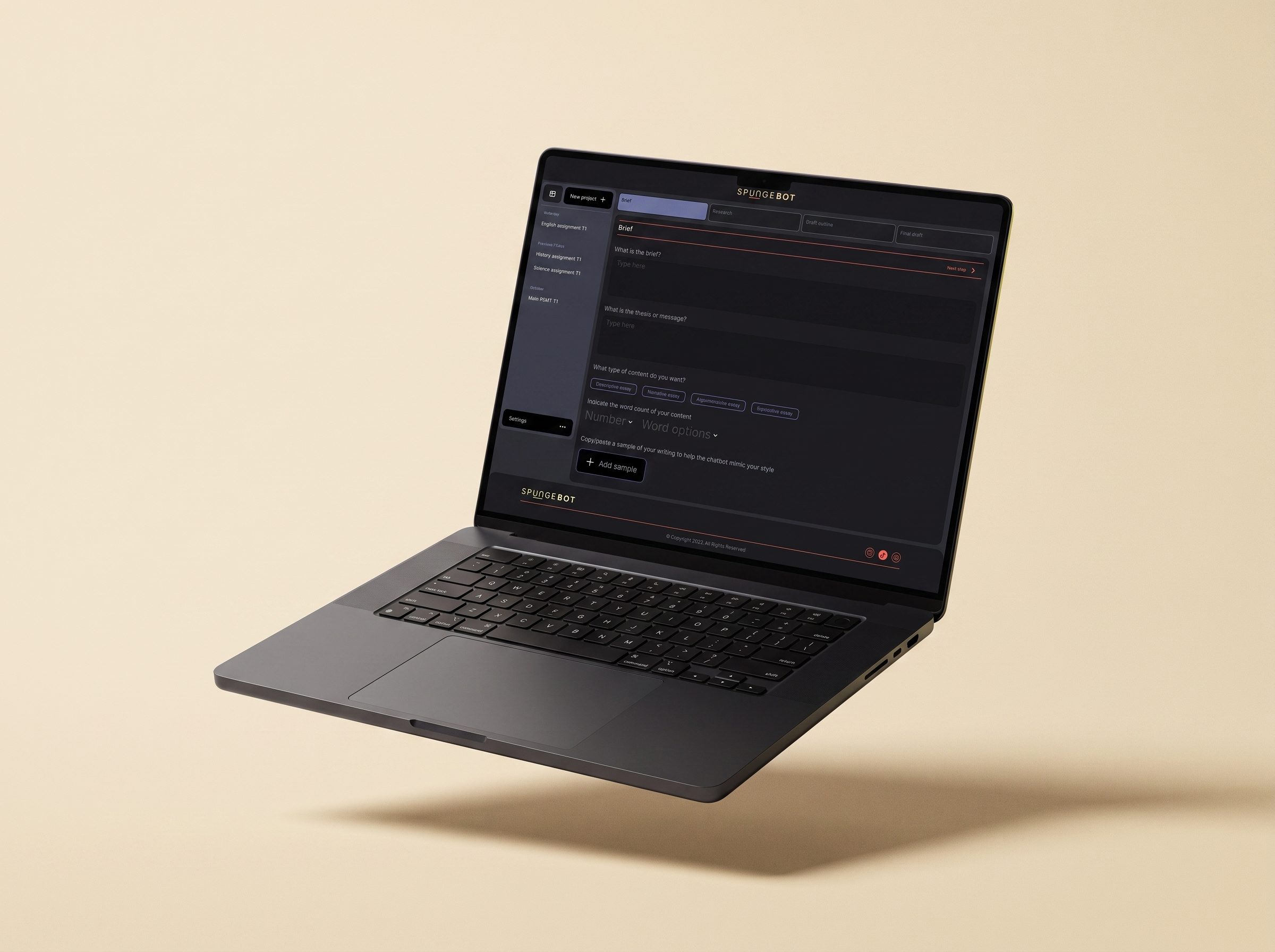
The whole tool follows a wizard pattern: brief, research, draft, final. Four steps, one at a time, always visible in the top bar. This wasn't chosen for elegance; it was chosen for empowerment.
The problem with open-ended AI chat for students isn't the AI. It's the blank prompt. Chat interfaces put the entire burden of asking the right question on the person who, if they knew how to ask, wouldn't be stuck in the first place. The wizard removes that burden. Every step tells the student what they're doing right now, what they've already done, and what's left. Progress is visible. Completion feels close. Anxiety drops the moment the flow starts.
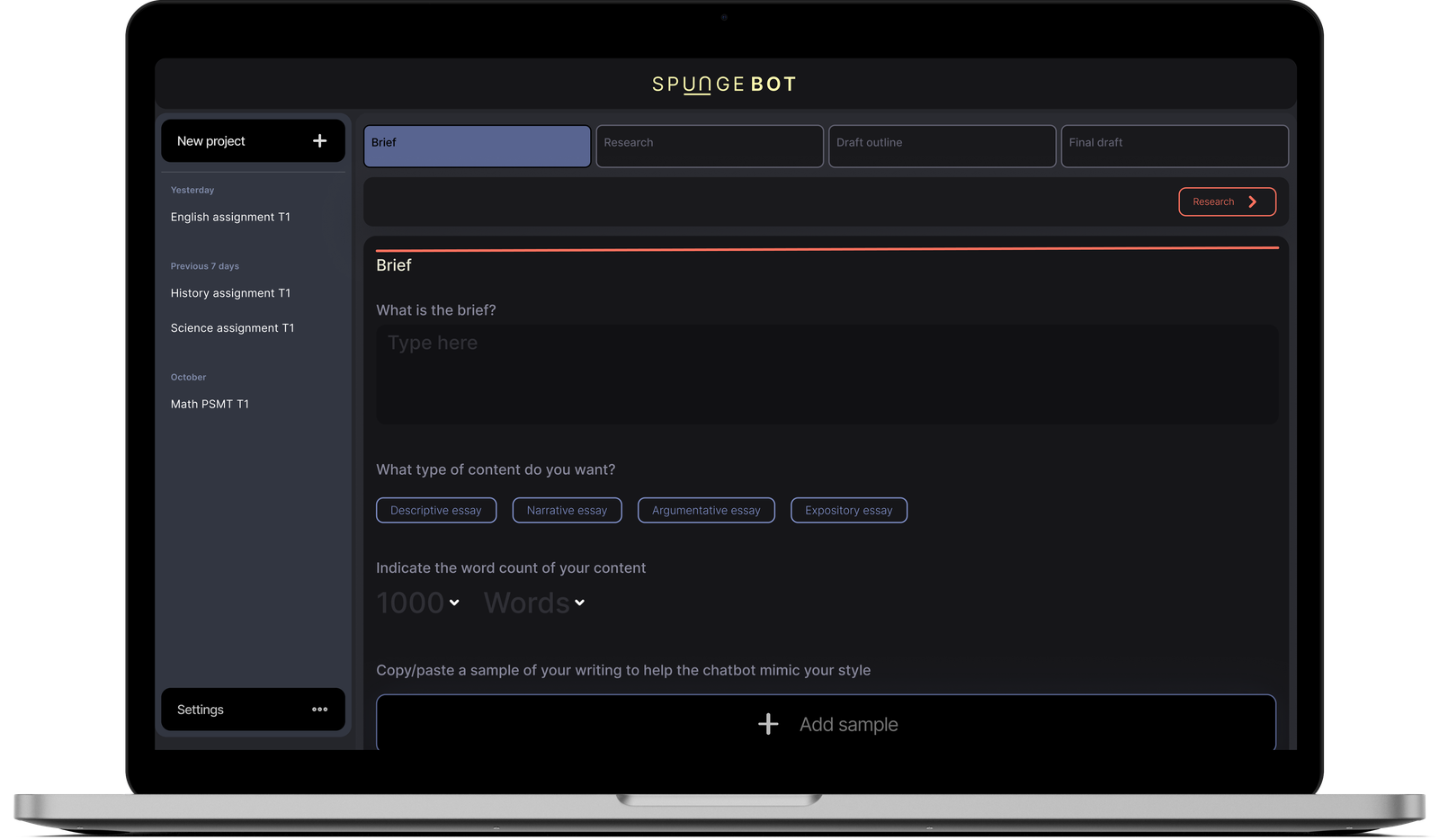
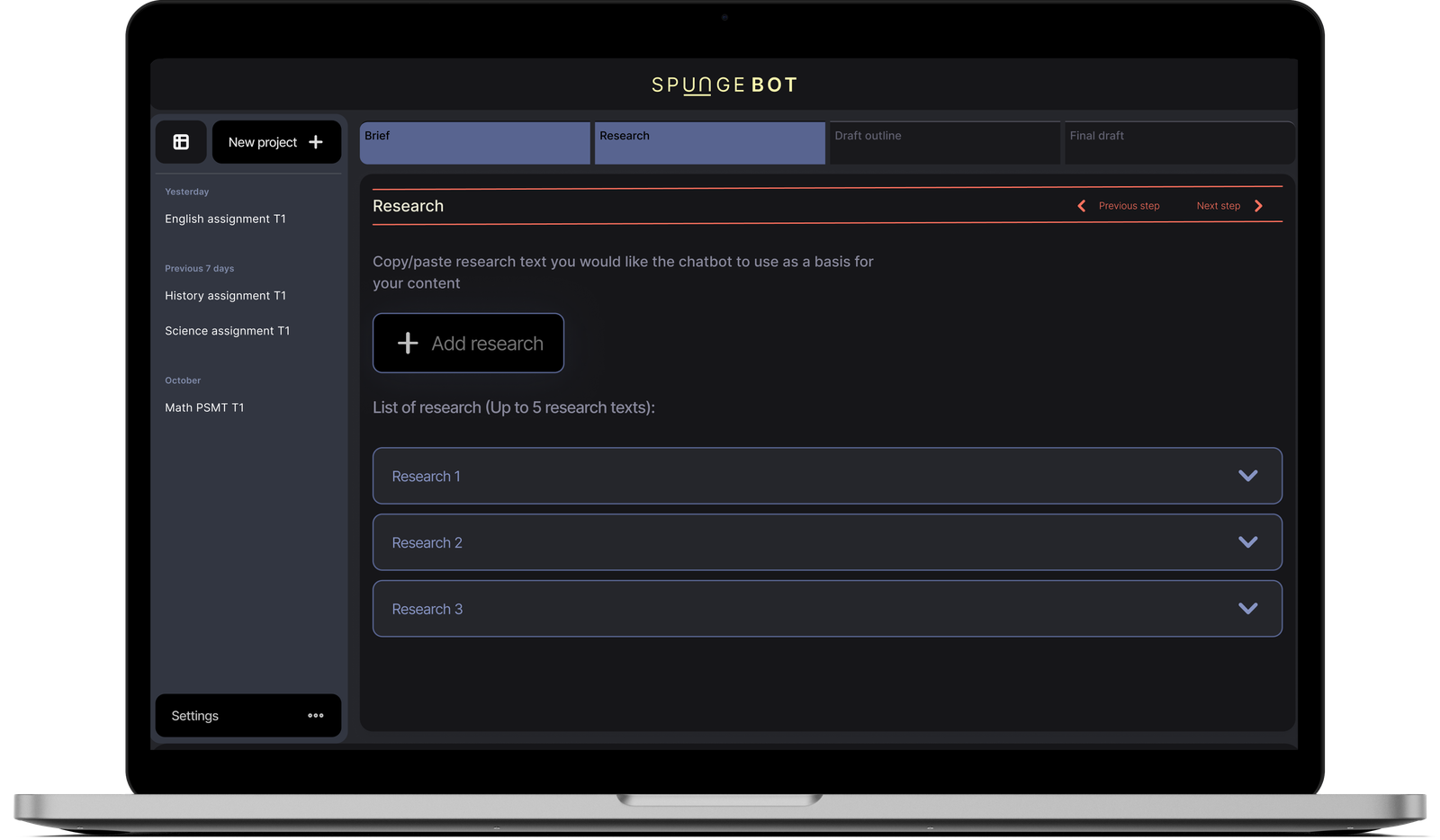
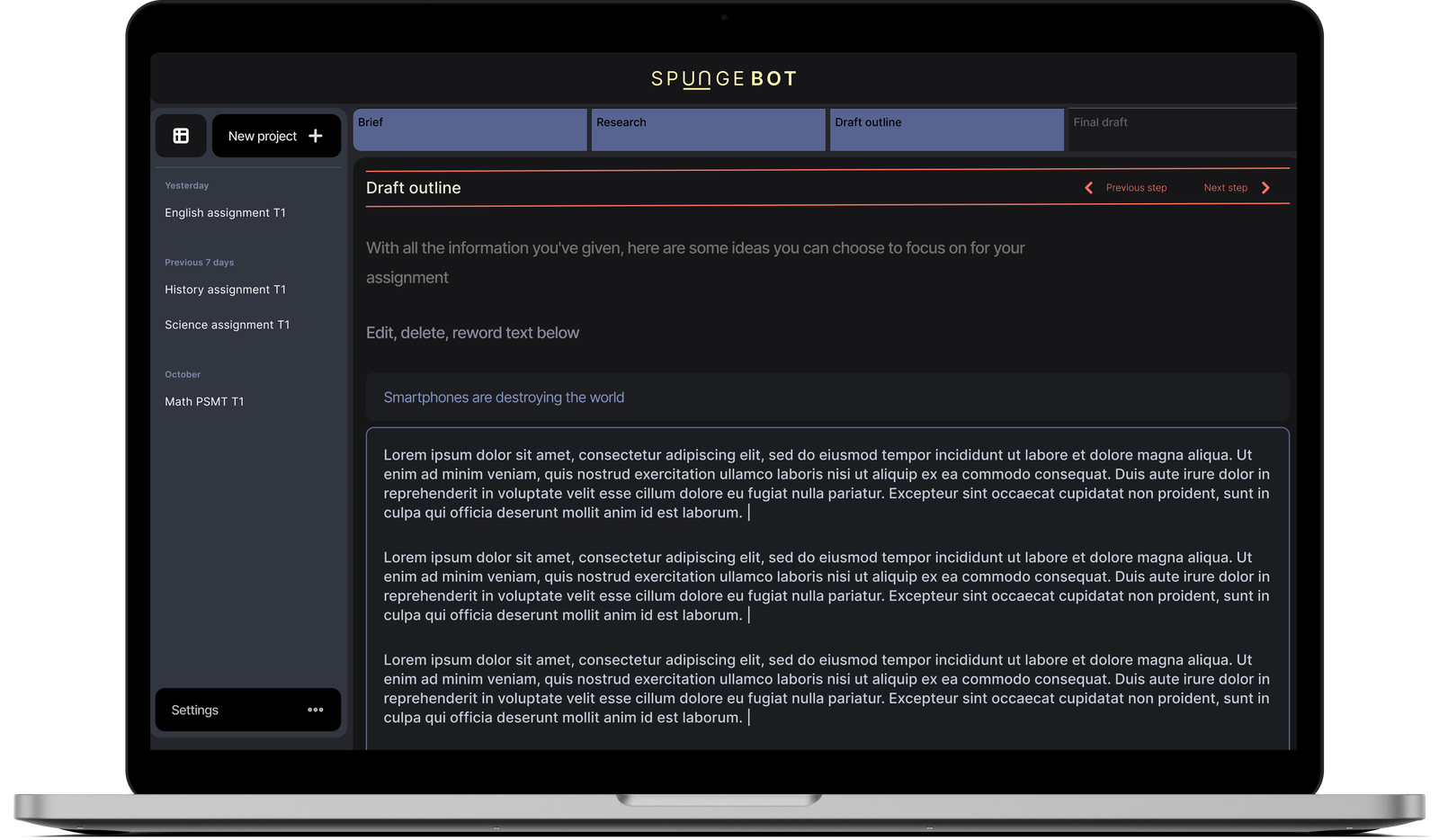
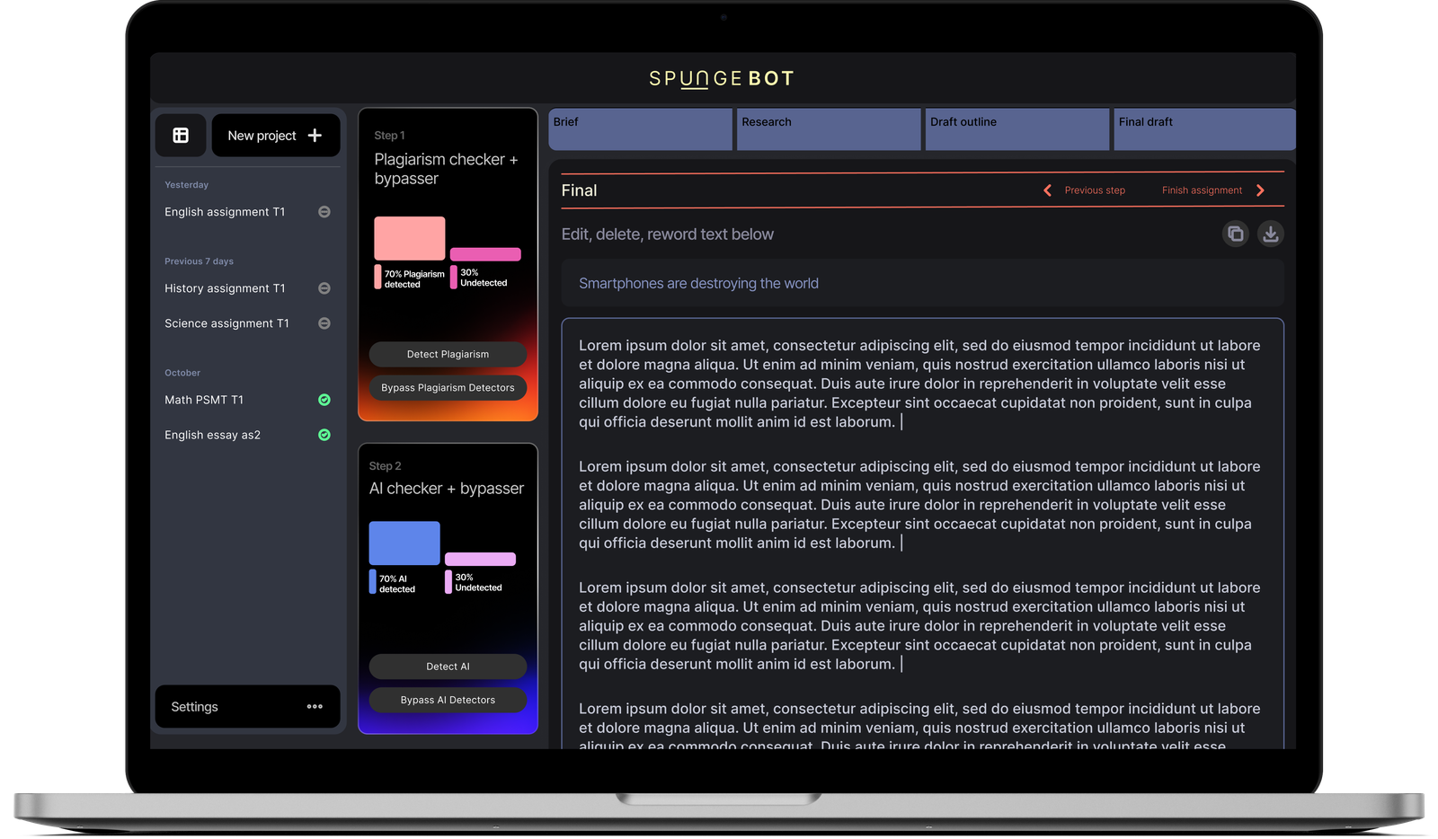
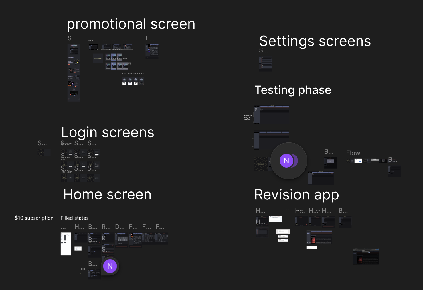
The workspace runs in a soft dark UI, and this was intentional. Students are stressed. They're often working late, often anxious, often already doubting themselves before they open a tool called "AI study helper." The dark UI does two things: it reduces visual noise so the writing takes centre stage, and it makes the tool feel like a private workspace rather than a corporate SaaS. Something closer to a secret weapon than a productivity app.
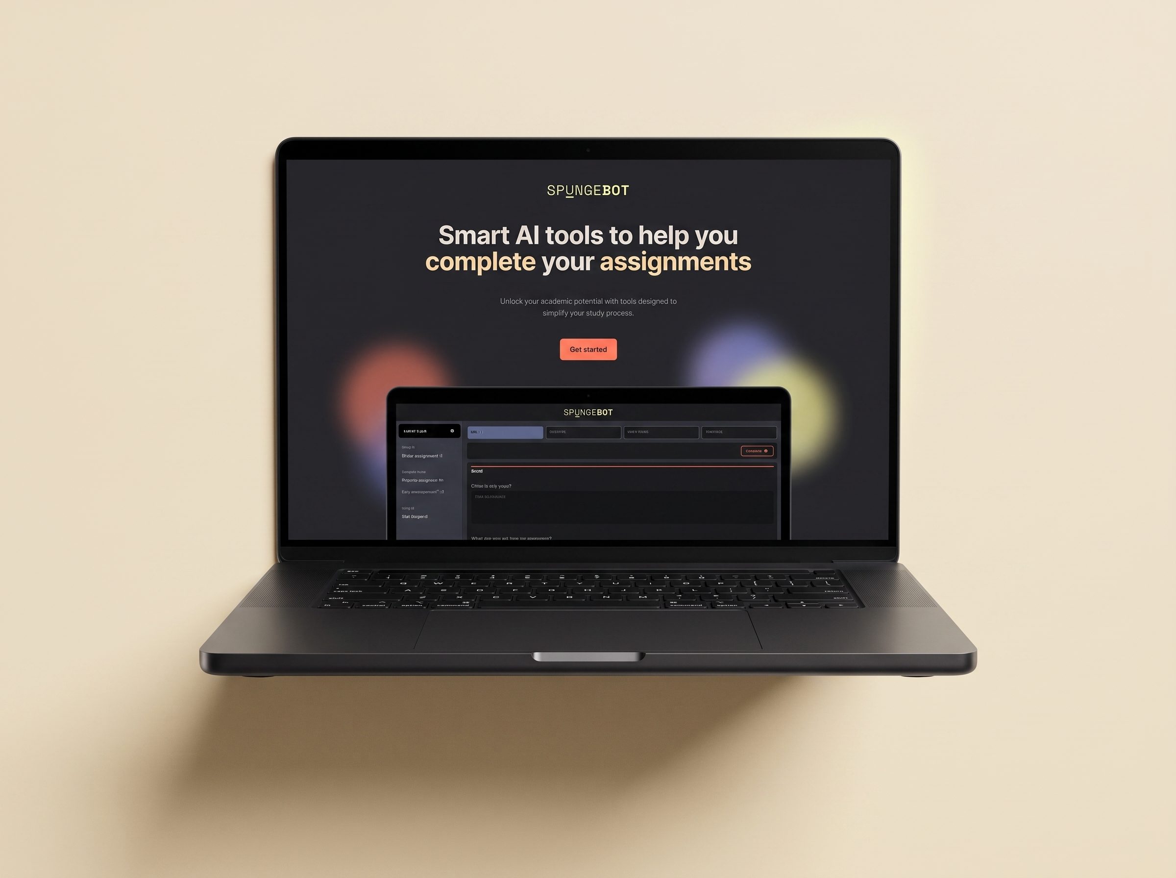
The marketing site inverts the whole system (warm cream, soft glows, gentle motion) because the invitation and the work are two different mental modes. You don't want your workspace to feel like a landing page, and you don't want a landing page to feel like homework.
The wizard isn't the constraint. It's the confidence.
The wordmark uses a stylistic ligature, the underlined u, that shows up again in the loader and the favicon. Small anchor. Big consistency. The coral CTAs, the mono section labels, the warm-glow backdrops on the marketing site: every small decision leans away from hyperactive assistant and toward considered study partner. That was the whole game.
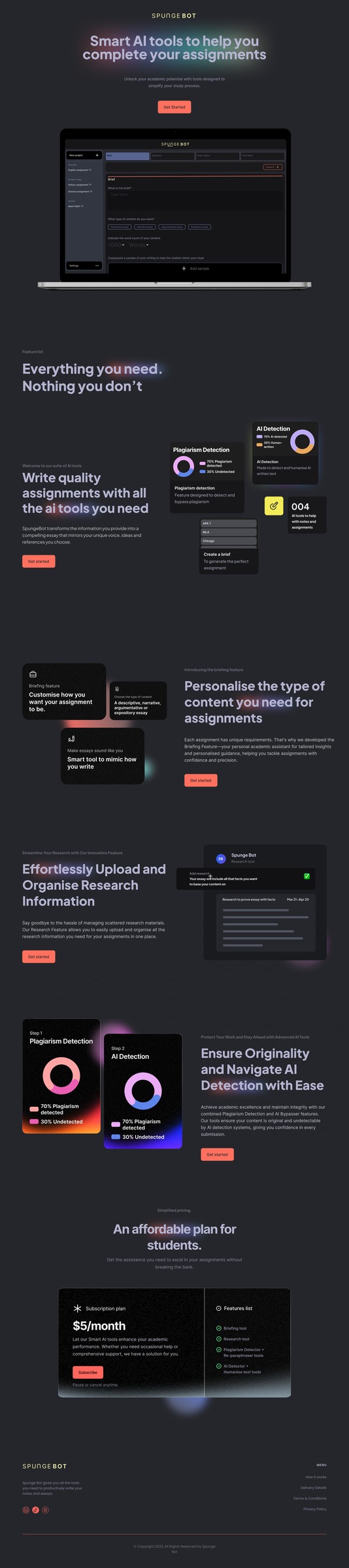
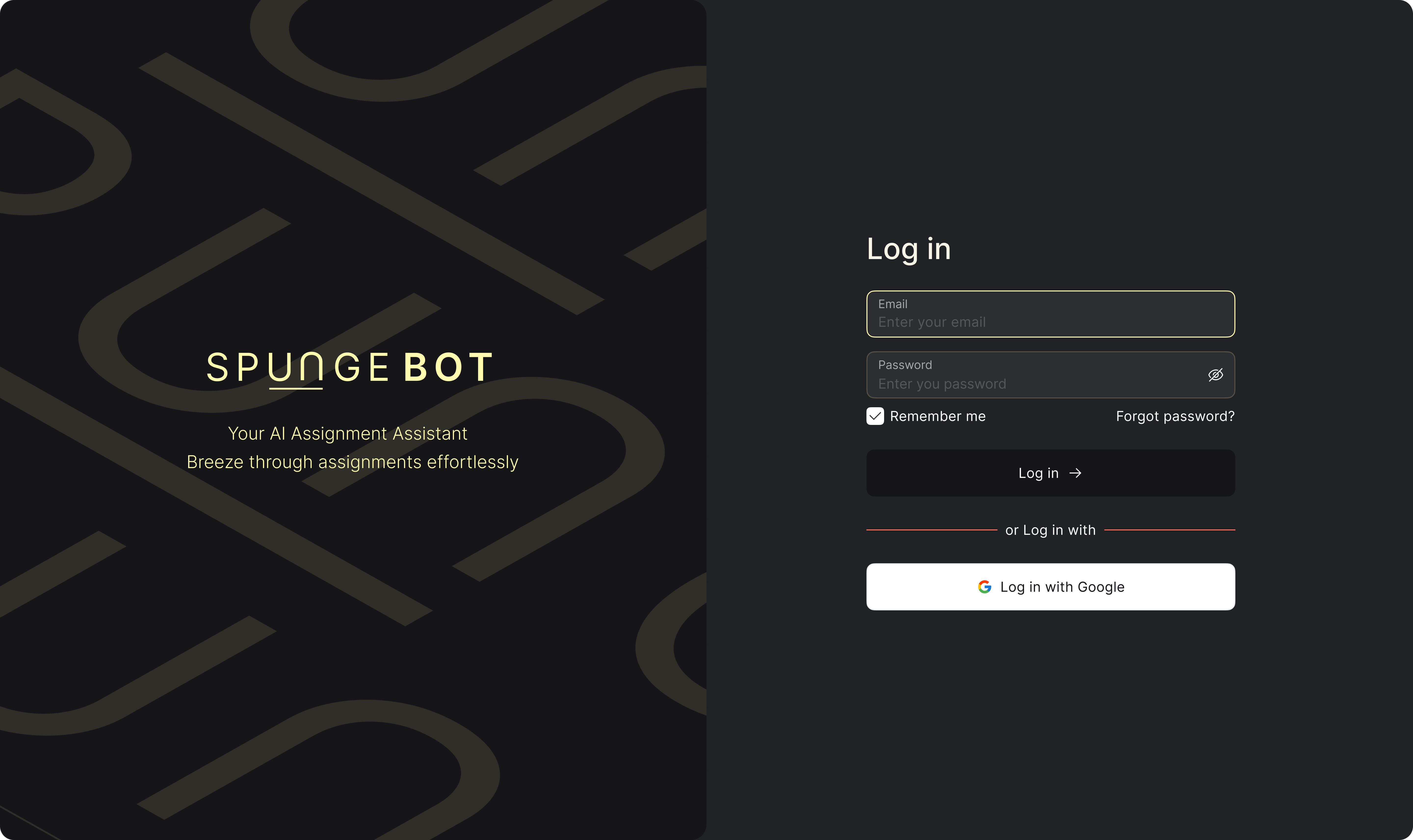
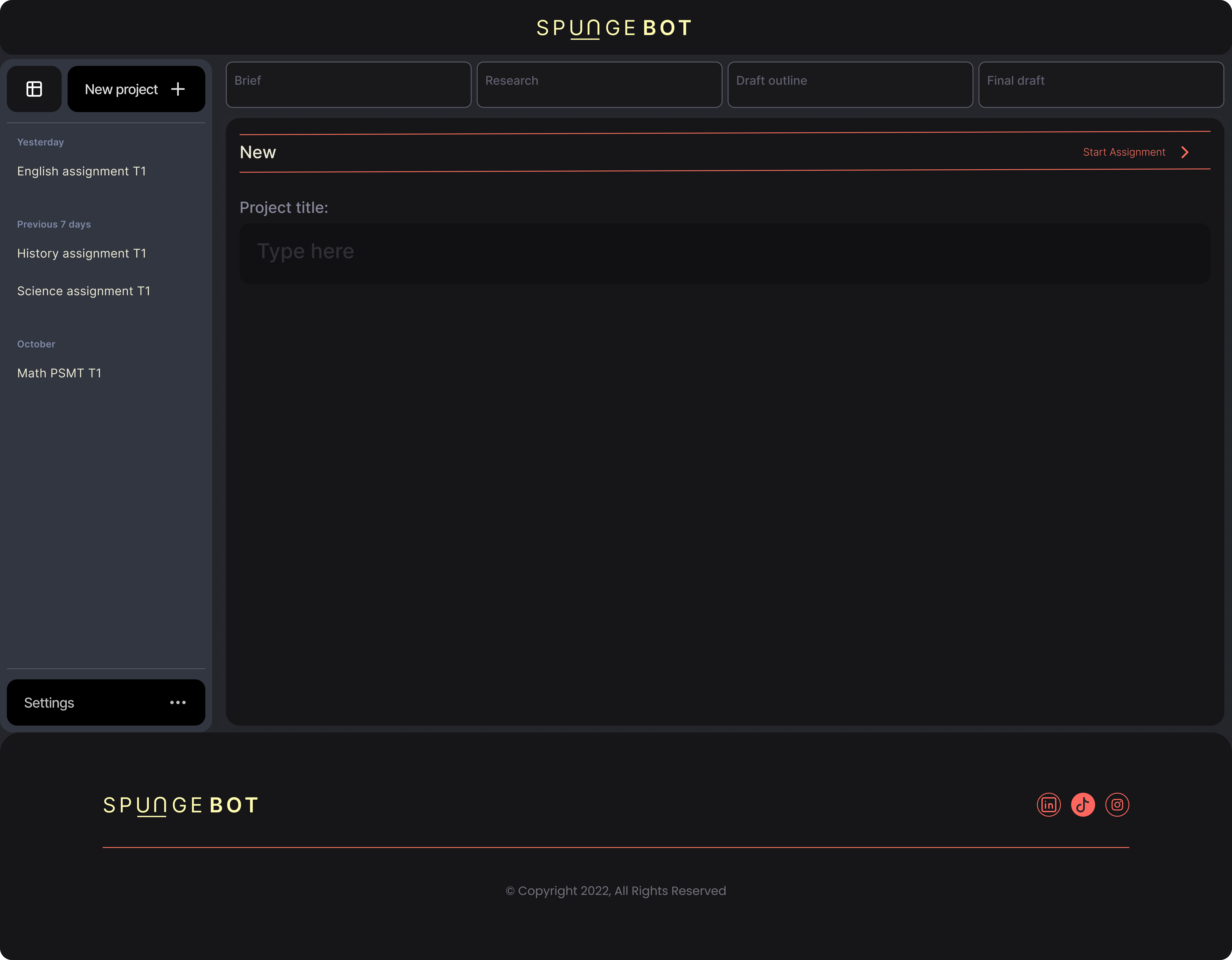
Students complete assignments end to end, from a blank brief to a submitted final draft, in a single sitting. The visible progress keeps momentum. The dark workspace fades into the background. The AI stops being the thing they think about; the assignment becomes it.
The wizard structure worked. What I'd add next is a review step between draft and final: not another AI prompt, but a checklist that asks the harder questions of the writer. And a bit more room in the brief step for students who don't know what they don't know yet.

Open to full-time roles, freelance briefs, and slow coffee chats.