BIFUR
A print love letter to a typeface that split the letter open.
A print love letter to a typeface that split the letter open.
A 16-page A5 typographic zine exploring Bifur, a display typeface designed by A.M. Cassandre in 1929 that stripped every letter to its essential recognition elements. It's one of the most radical experiments in twentieth-century display type. Almost no one under thirty has heard of it.
The zine was written for readers who care about typography but aren't necessarily type historians: designers who want the story, not a textbook. The reader's goal isn't to memorise dates. It's to feel why Bifur mattered, and to hold a print object that argues its case in its own construction.
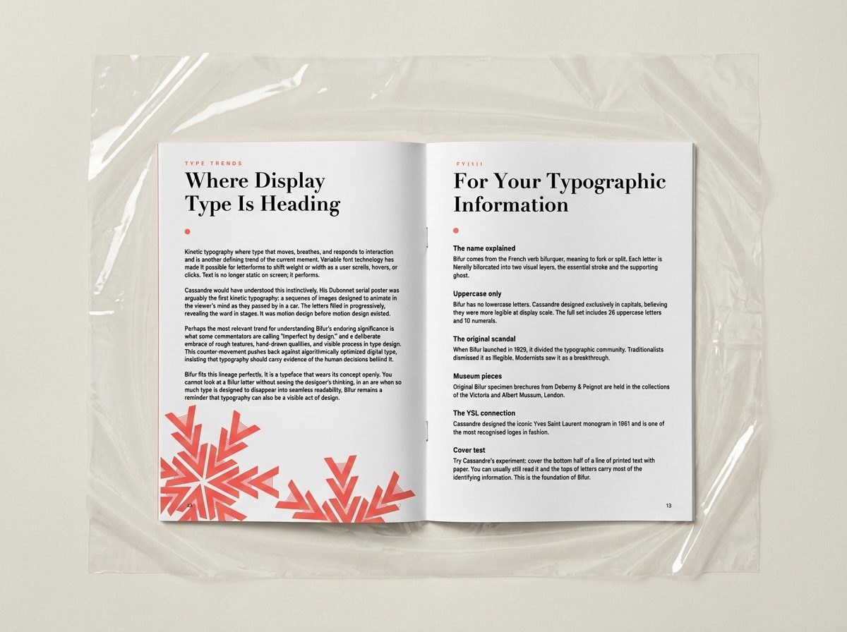
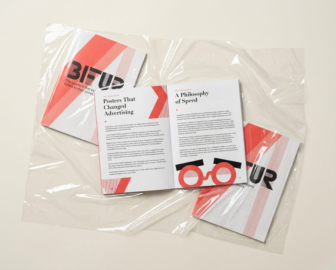
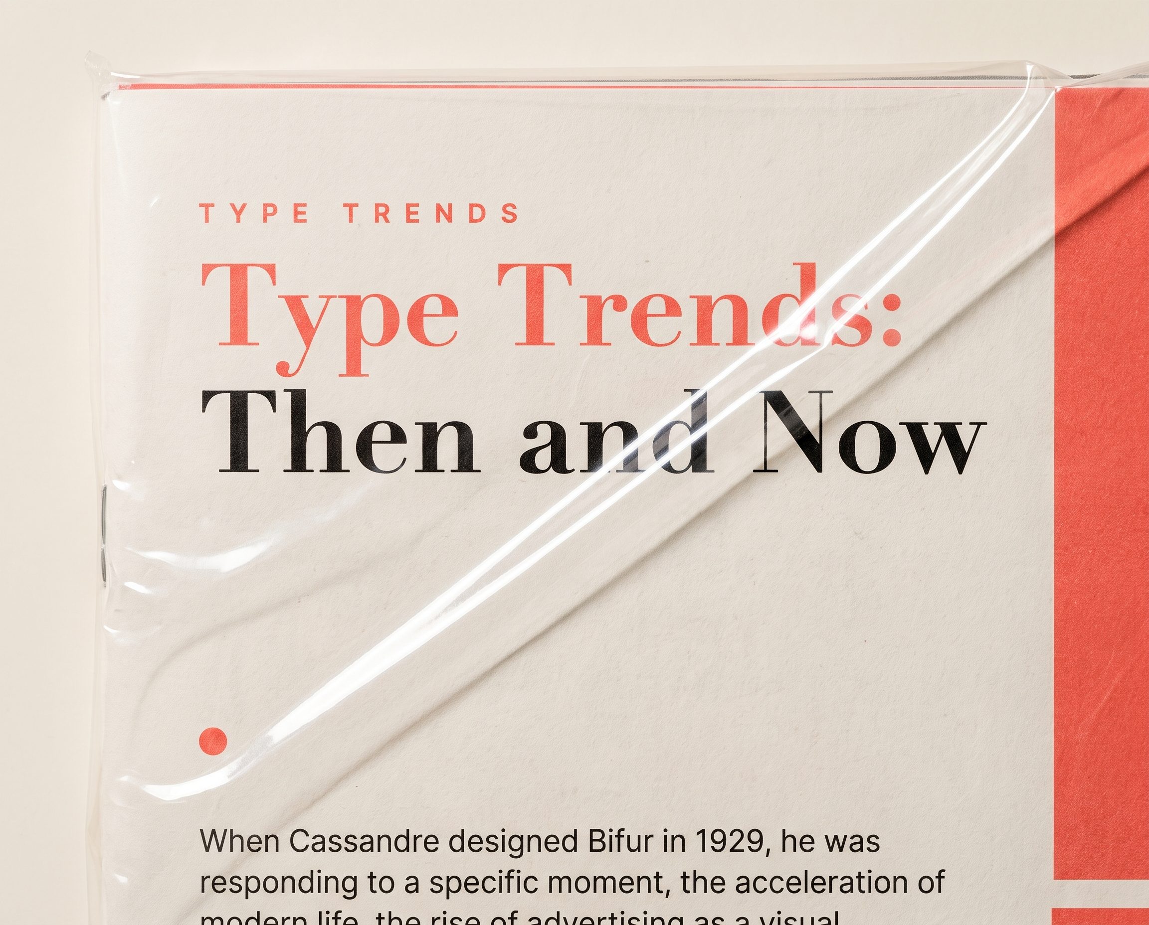
The brief gave me a maximum of two colours plus paper stock, two typefaces, and only three images across sixteen pages. It felt restrictive on paper. In practice it was the best thing that could have happened to the project.
The three-image rule meant almost every page had to earn its visual interest through typography alone: scale, weight, spacing, and the interplay between black type and white space. Which is exactly what Cassandre had to solve in 1929, working with lead and ink. The constraint mirrored the subject.
The plastic-wrap photography treats each printed copy as a specimen: sealed, catalogued, waiting to be opened. Design zines used to look like this. Some still should.
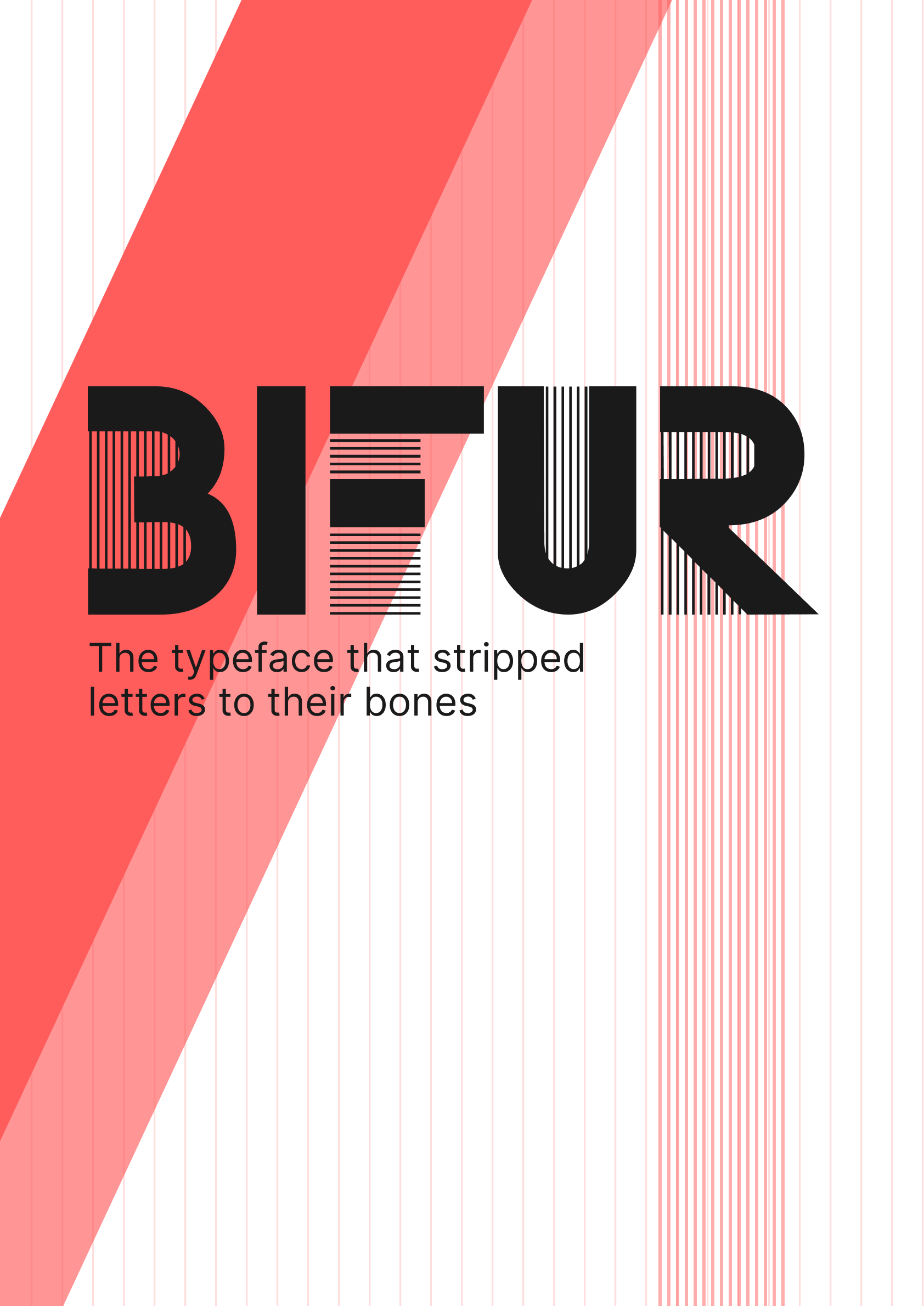
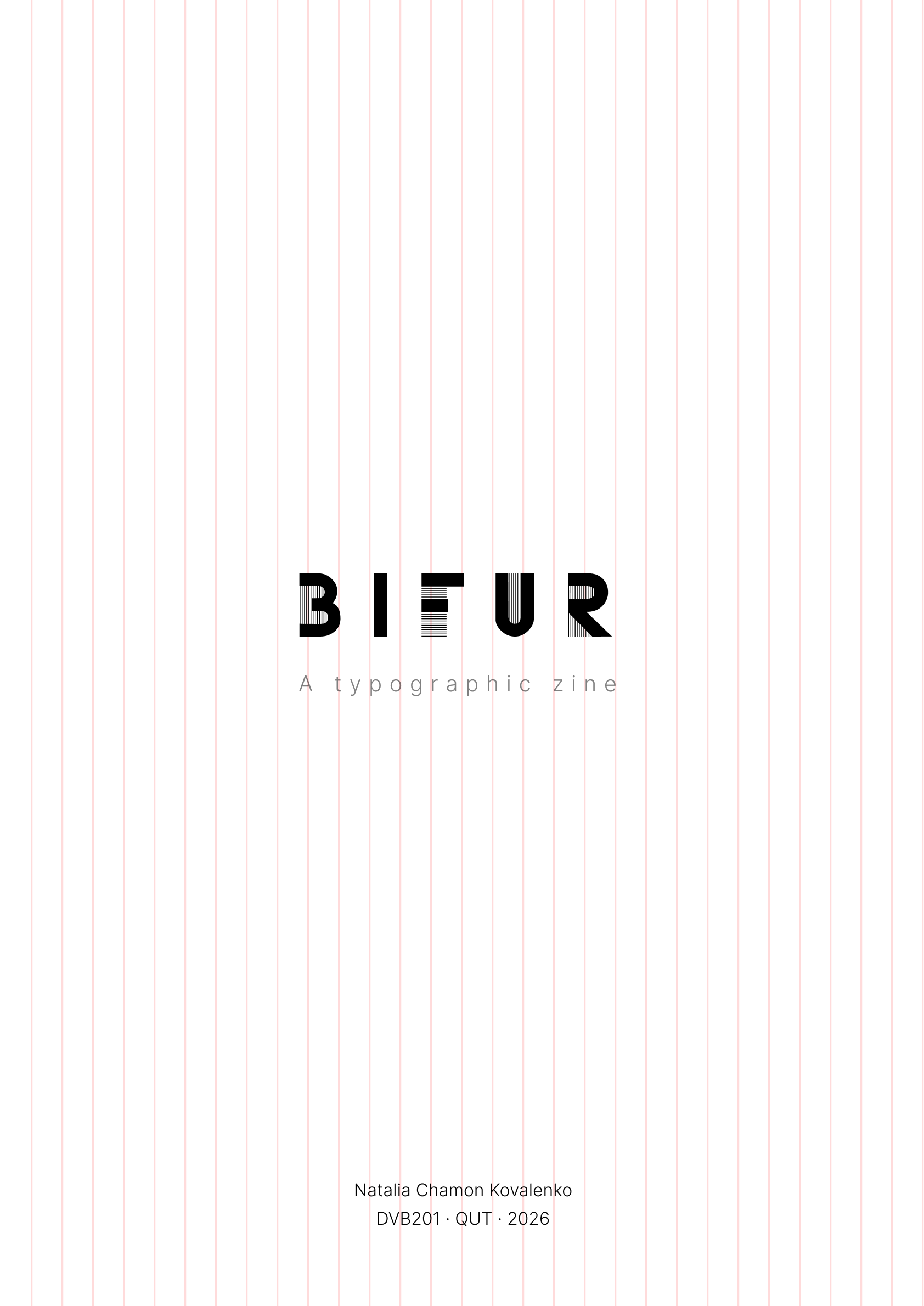
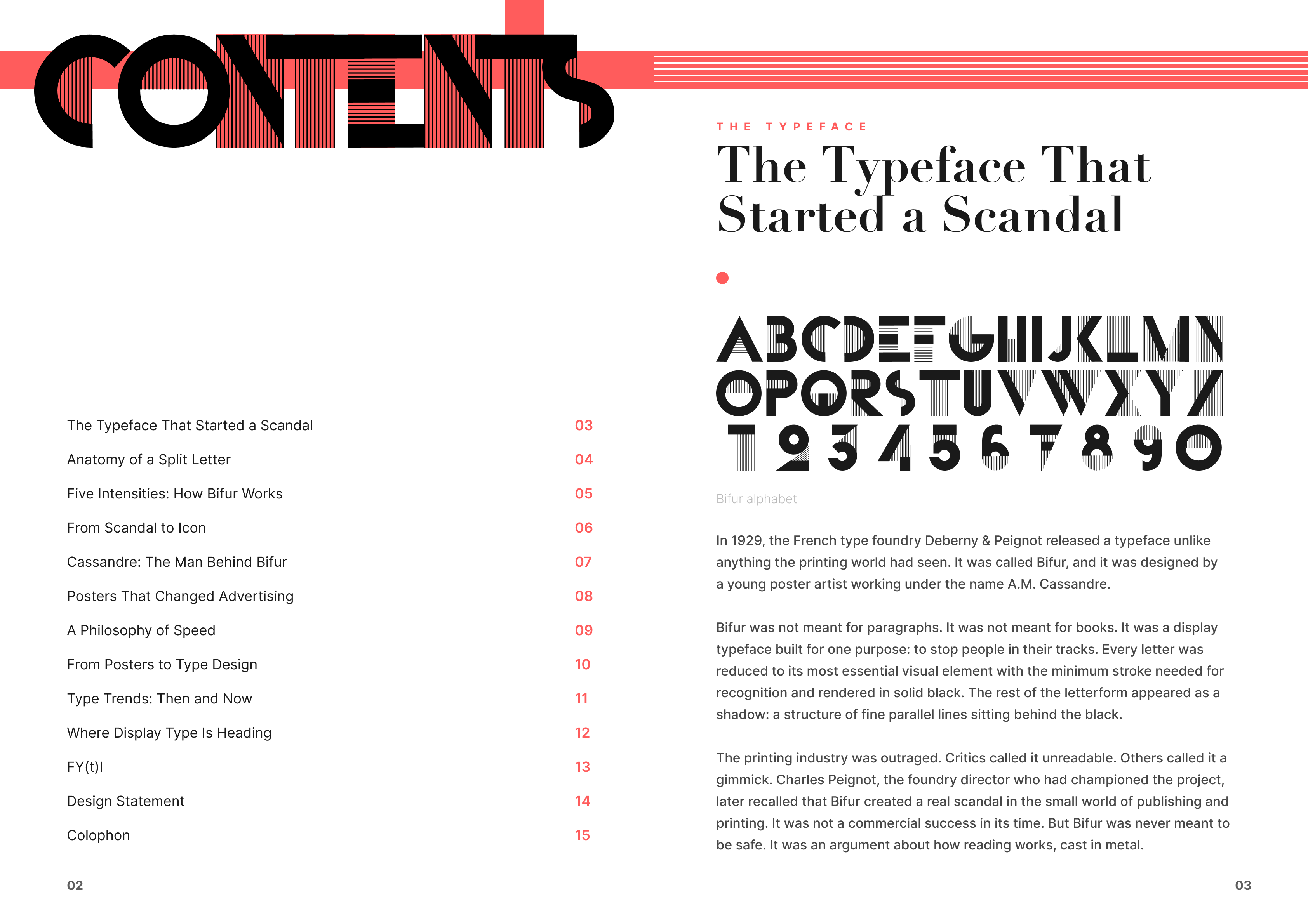
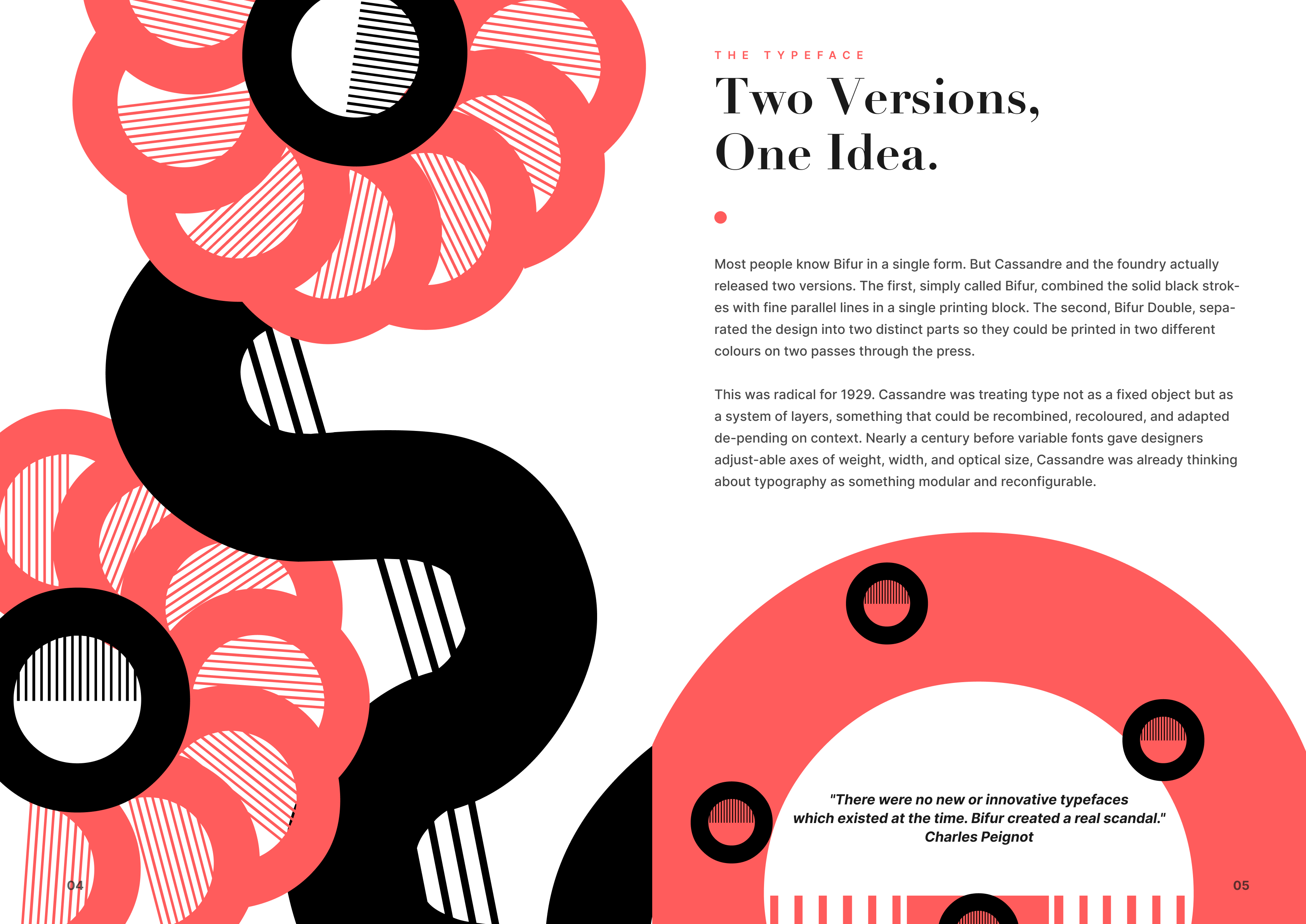
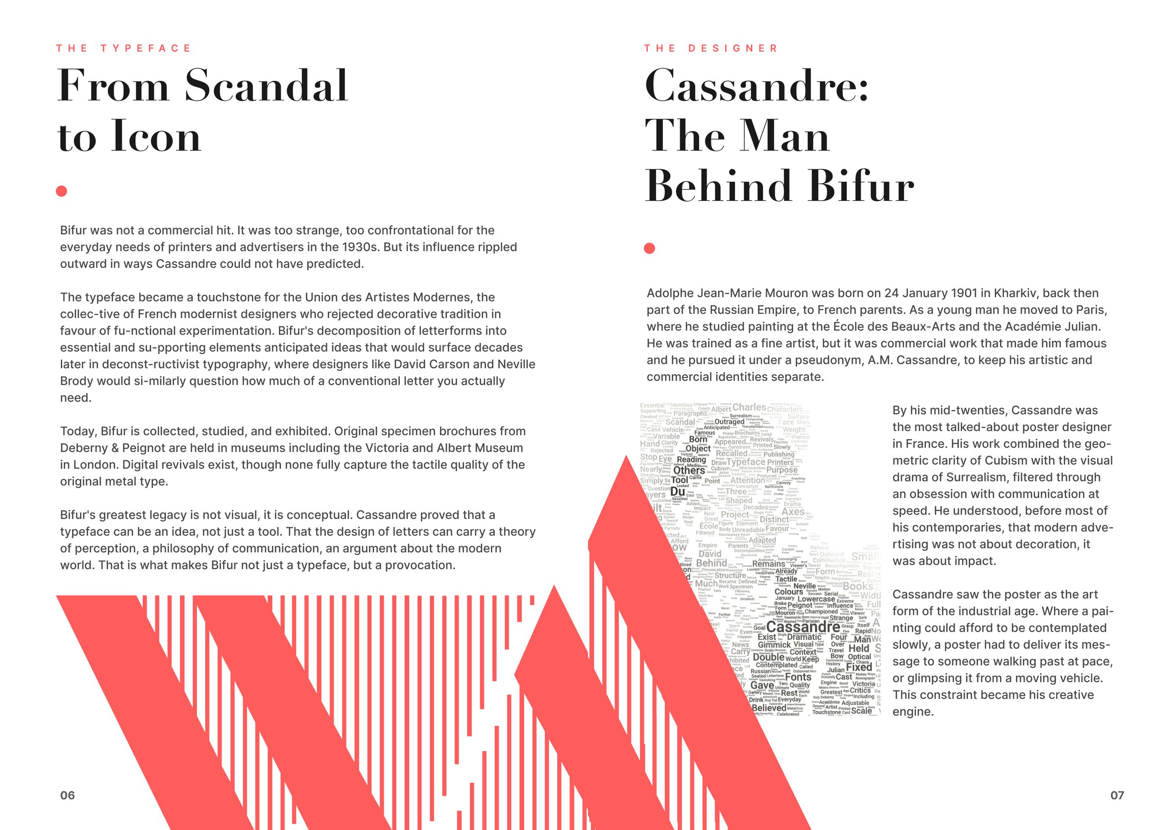
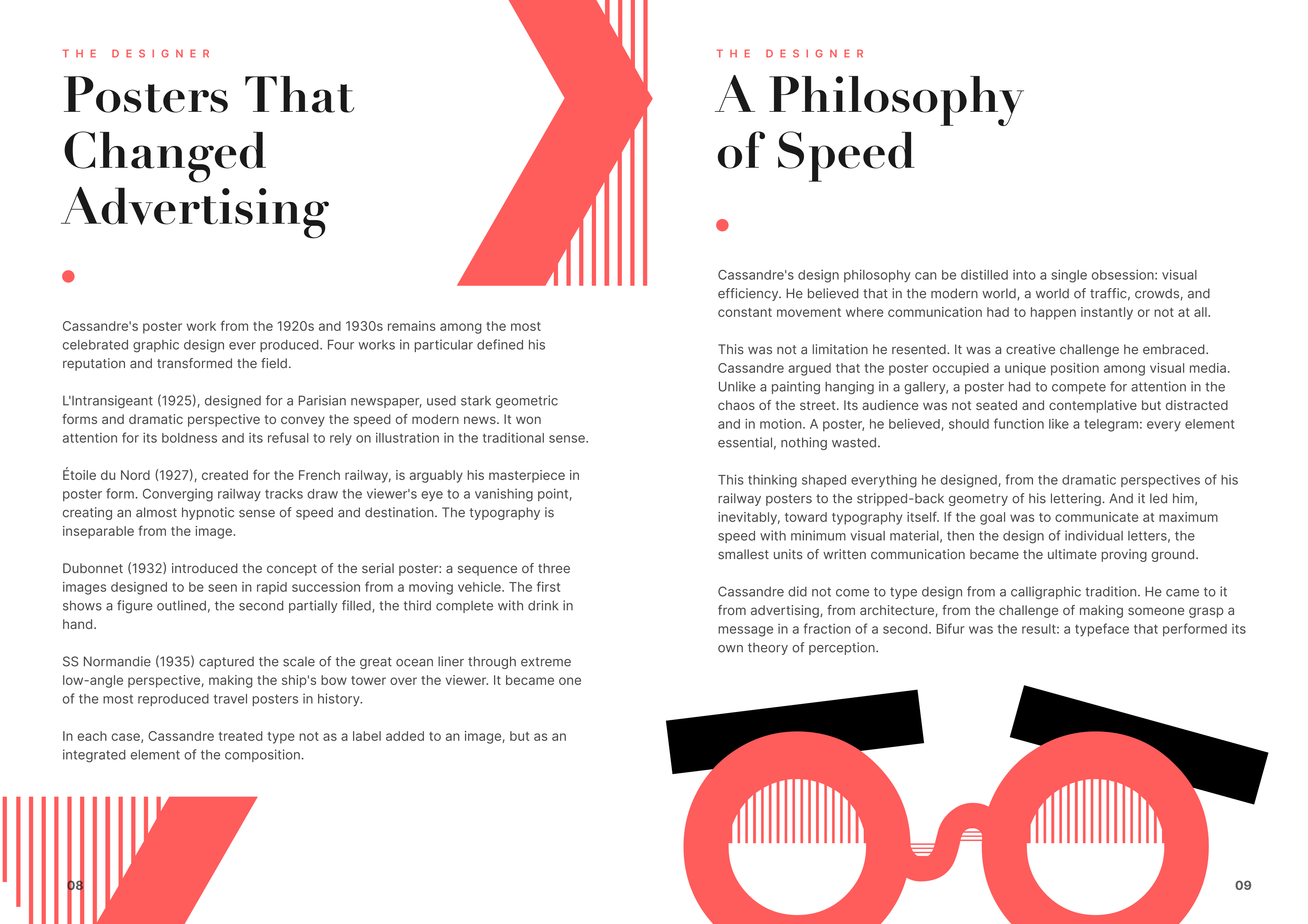
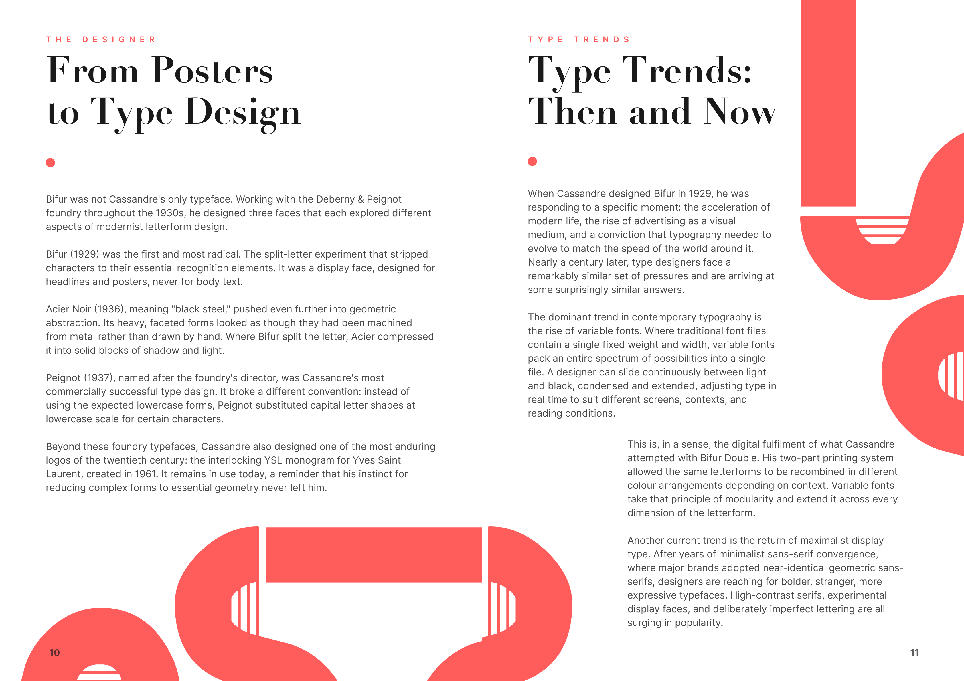
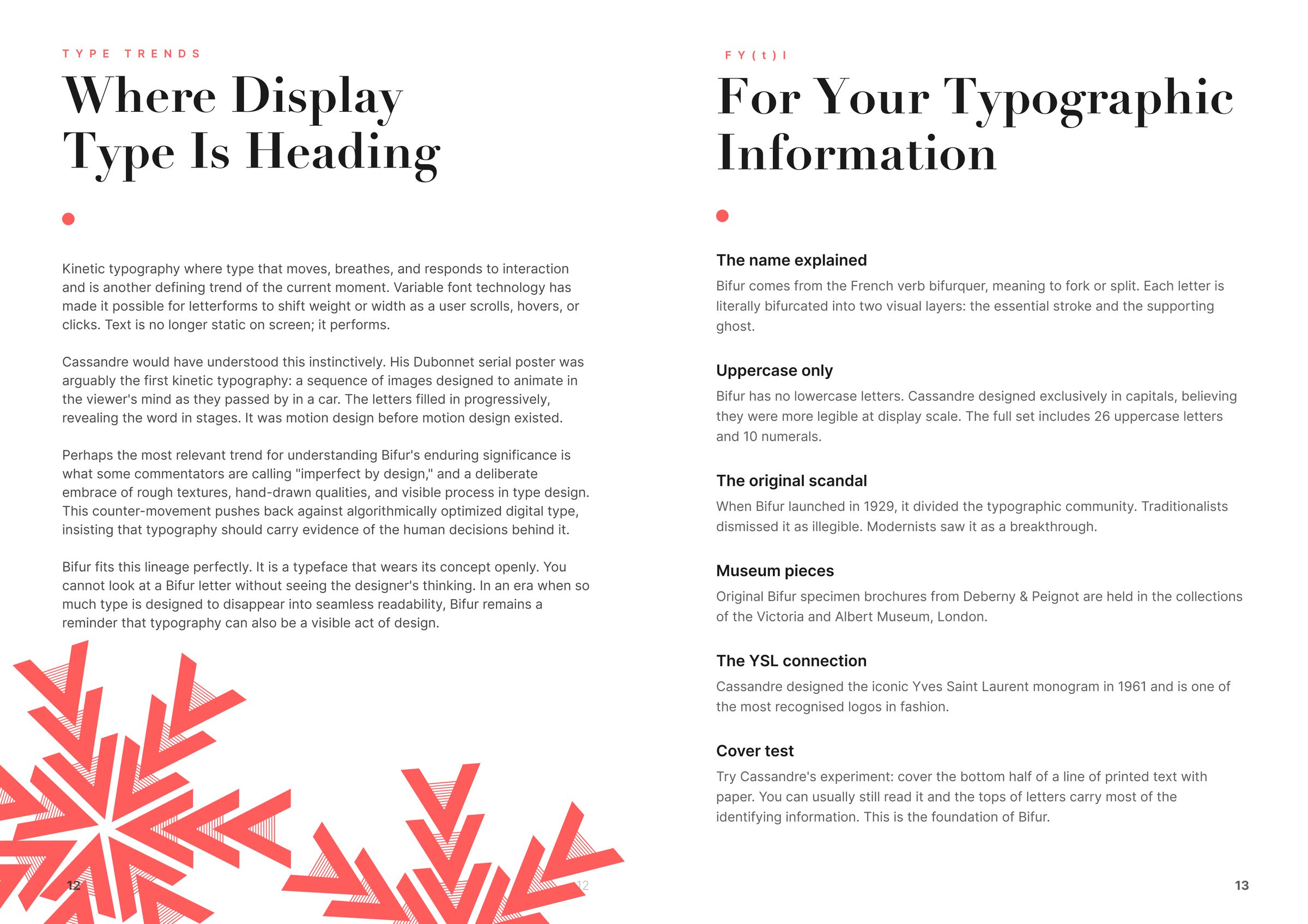
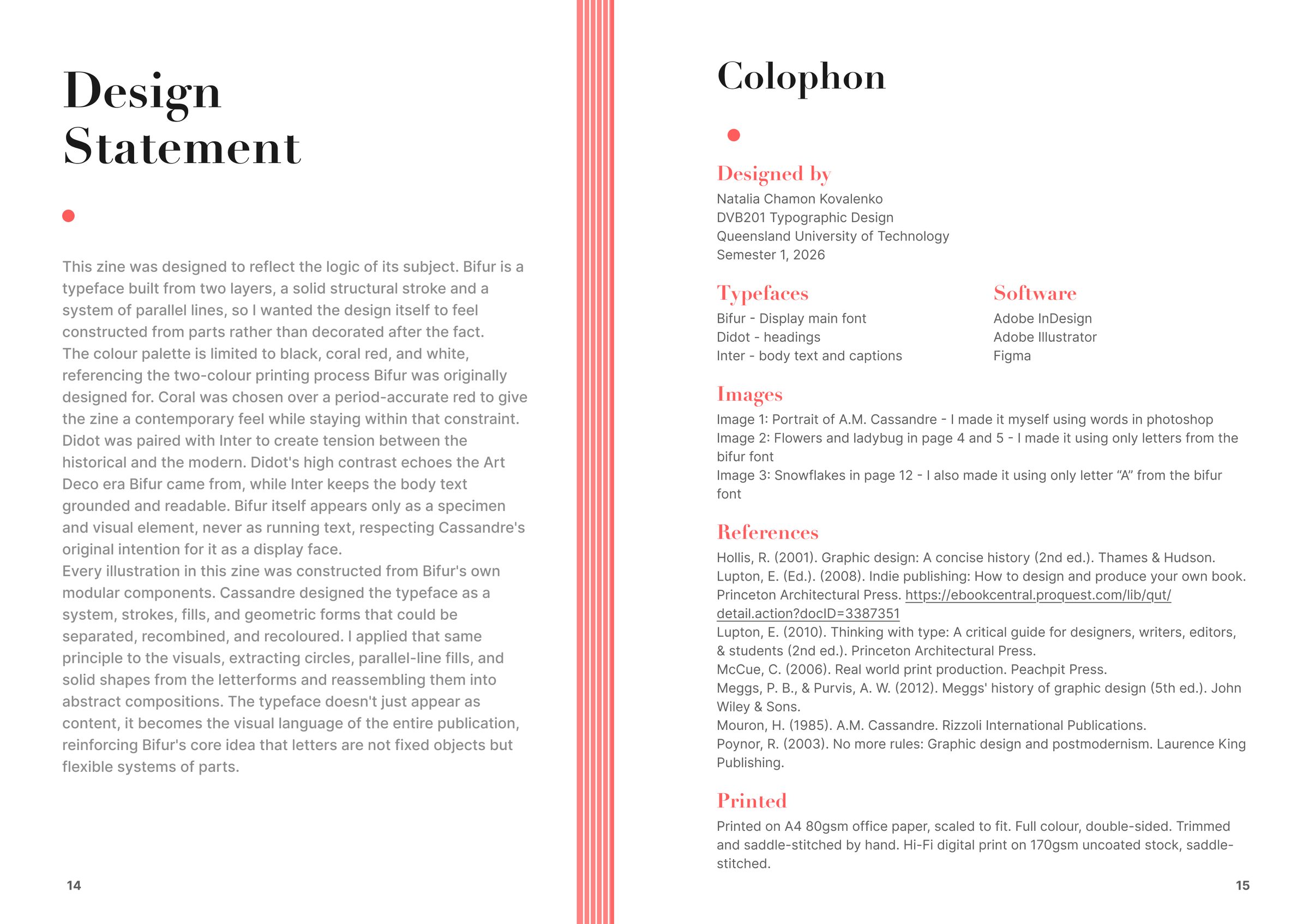
The core system is a vertical line motif that runs from the cover to the back page. It's a direct nod to Bifur's own construction: the parallel lines that fill the secondary layer of each letter. Using it as a structural element (header blocks, cover composition, background textures) meant the zine's own visual system was performing the argument, not just describing it.
The typeface pairing was a deliberate tension: Didot for display headings, Inter for body. Didot connects the zine to the tradition of refined typographic craft Cassandre inherited and disrupted. Inter gives the body text the functional, contemporary readability the writing needs. The two live at exactly the intersection Bifur itself occupied: decorative tradition meeting modernist clarity.
Black and coral red on white for the palette. Coral because it echoes the boldness of Bifur's original black-and-grey split without pretending we're printing letterpress in 1929. Two colours only, which forced every hierarchy call to be sharp: coral had to earn its appearance every time it landed on the page.
Typography can be content, not just a way to deliver it.
The plastic wrap is the wink. It says: this isn't a book you flip through casually. It's a specimen you open with intention. Which is exactly how Bifur was meant to be read the first time around, when it landed in Deberny & Peignot's 1929 catalogue.
Sixteen pages that treat typography as the subject, the medium, and the argument all at once. The vertical line motif, the coral accents, the Didot-Inter tension, the plastic-wrap presentation. Every design decision points back at Bifur's central idea: how much of a letter do you actually need to see.
Before this project I thought about typography as a delivery tool, a way to move words from the page into someone's head. Designing a zine that had to communicate almost entirely through type changed that. Type turned out to be capable of carrying ideas, arguments, and emotional weight independent of the words it spells.
That shift is the thing I carry into every project now, whether it's a print zine, a product interface, or a brand system. If typography is content, then choosing a typeface is choosing what the work believes.

Open to full-time roles, freelance briefs, and slow coffee chats.