Ryte
Ritual, without the ceremony.
Ritual, without the ceremony.
Ryte is a daily wellness and astrology app built for the whole spectrum of readers: the sceptic-curious, the casual believer, and the deep believer. The app doesn't ask you to pick a camp. It gives everyone the same tool: a gentle daily rhythm of reflection, journal prompts, moon sessions, and tarot pulls that treat astrology as a way to plan your life, not to predict it.
The primary user goal isn't find out what my chart says. It's feel connected to yourself, reflect, and get a bit of guidance on the day ahead. Ritual as a design pattern, for people who want the frame without the pressure to convert.
Every existing astrology app I looked at was designed for the deep believer: purple gradients, starfields, mystical serif wordmarks, language that assumed the reader already spoke the vocabulary. That aesthetic reads as opt-in only. Sceptics bounce; casuals feel like they've walked into a bookshop they don't belong in.
Ryte had to sidestep the whole cliché and still feel like it belonged in the category. The tone had to be warm enough for the deep believer to feel at home, and neutral enough for the sceptic-curious to open the app without cringing. Every visual decision was checked against both ends of the audience at once.
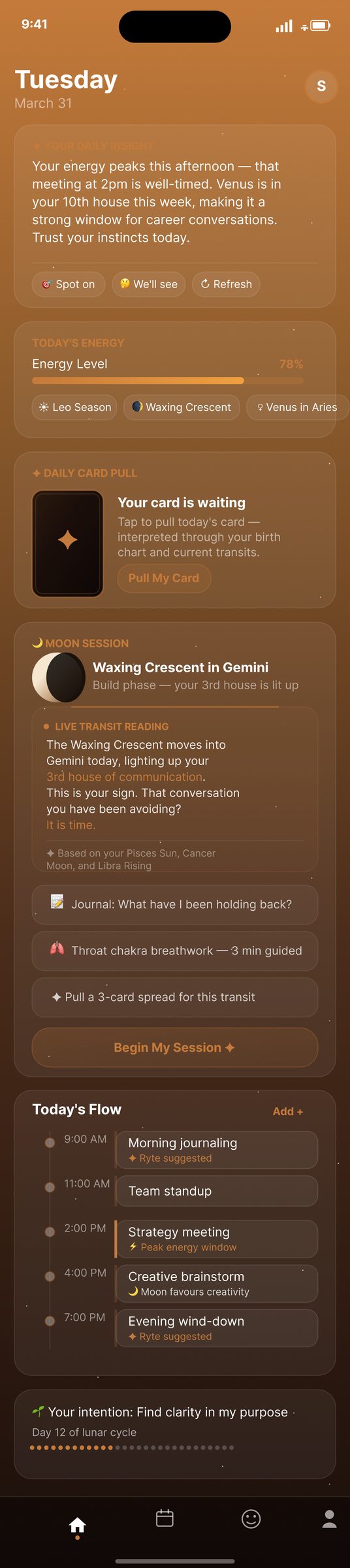
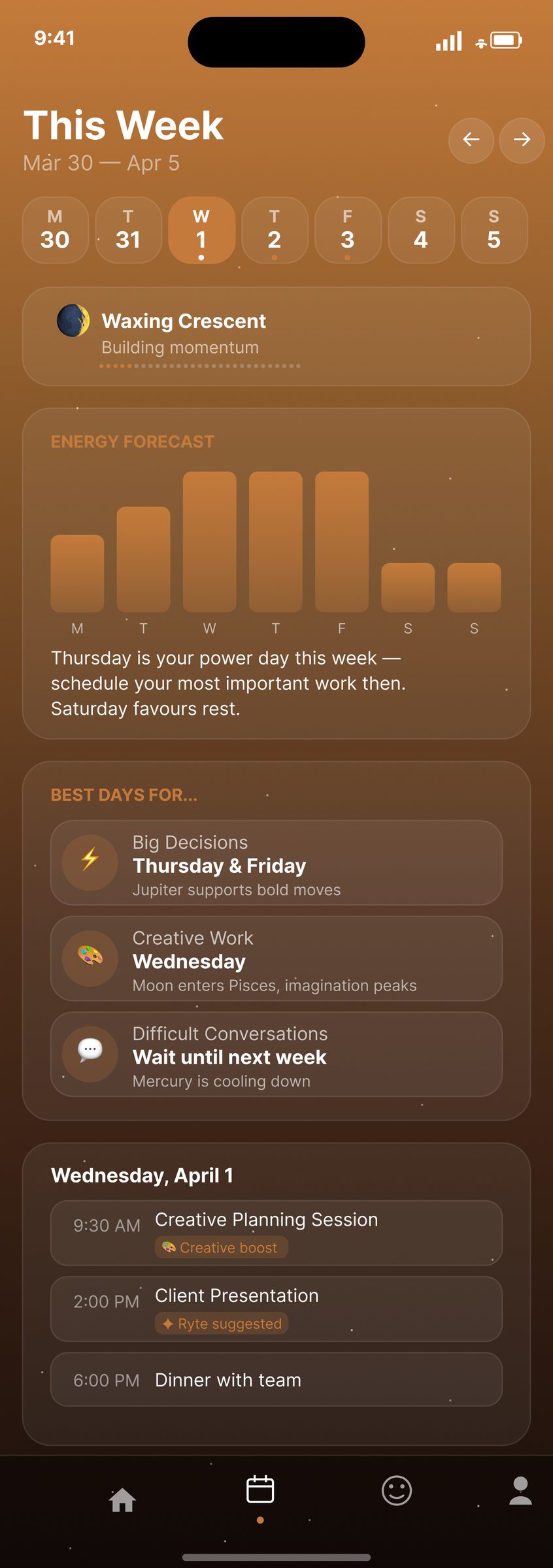
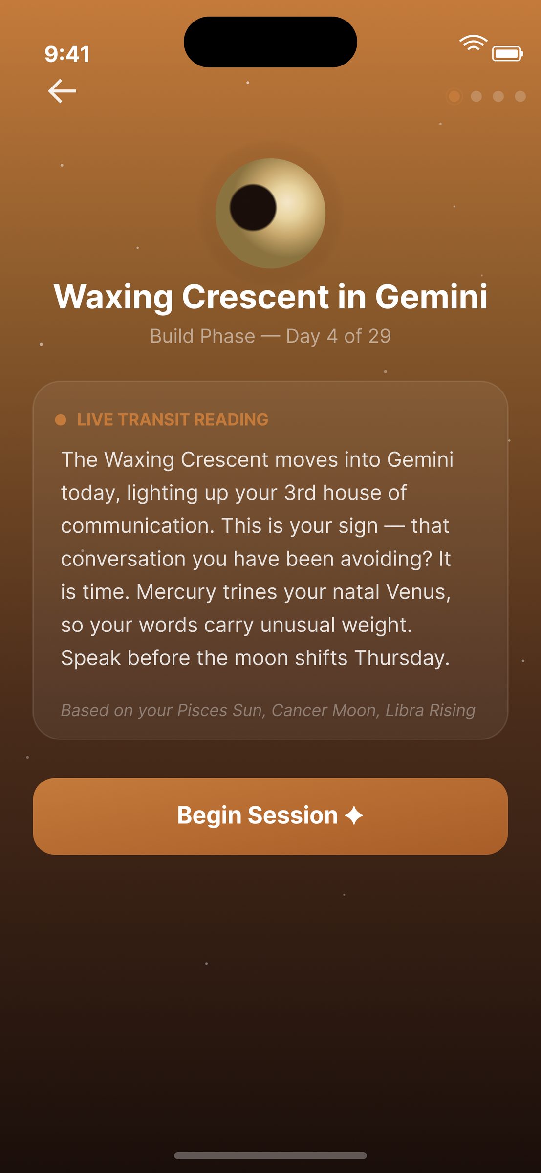
The colour palette was the single most deliberate decision in the whole system. Warm amber gradients, deep browns, cream cards, soft coral accents, a palette that imitates a sunrise. The metaphor does real work: every time someone opens the app, the visual language quietly says new day, new you, ever evolving. Growth as an ambient design pattern.
Beyond the metaphor, the palette is functional. Warm tones lower the visual temperature of the interface, which lowers the emotional temperature of the moment. The app should feel like a safe sanctuary, something you open to sit with yourself, not something you open to be told what's wrong.
A new day, a new you. Ever evolving.
The frosted glass cards, muted coral CTAs, and calm bottom nav all sit inside that same restraint. Tarot pulls are framed as journal prompts first, oracle second: every card links to a question the user is invited to sit with. The moon session lets someone slow down, breathe, and mark the phase. Astrology becomes the rhythm of the app, not the point of it.
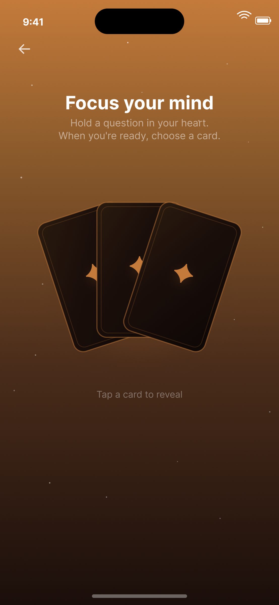
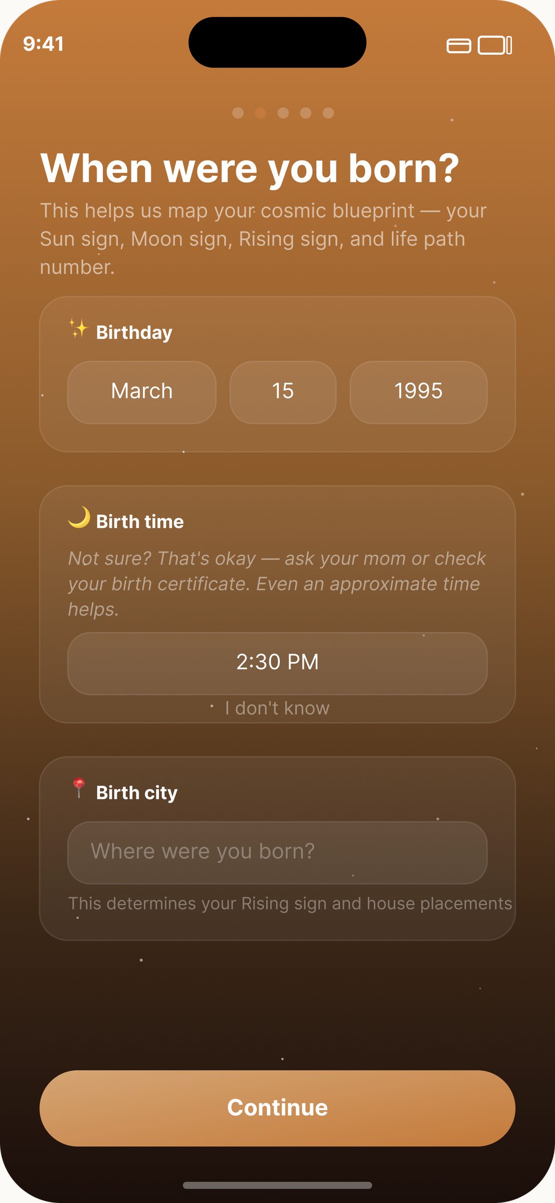
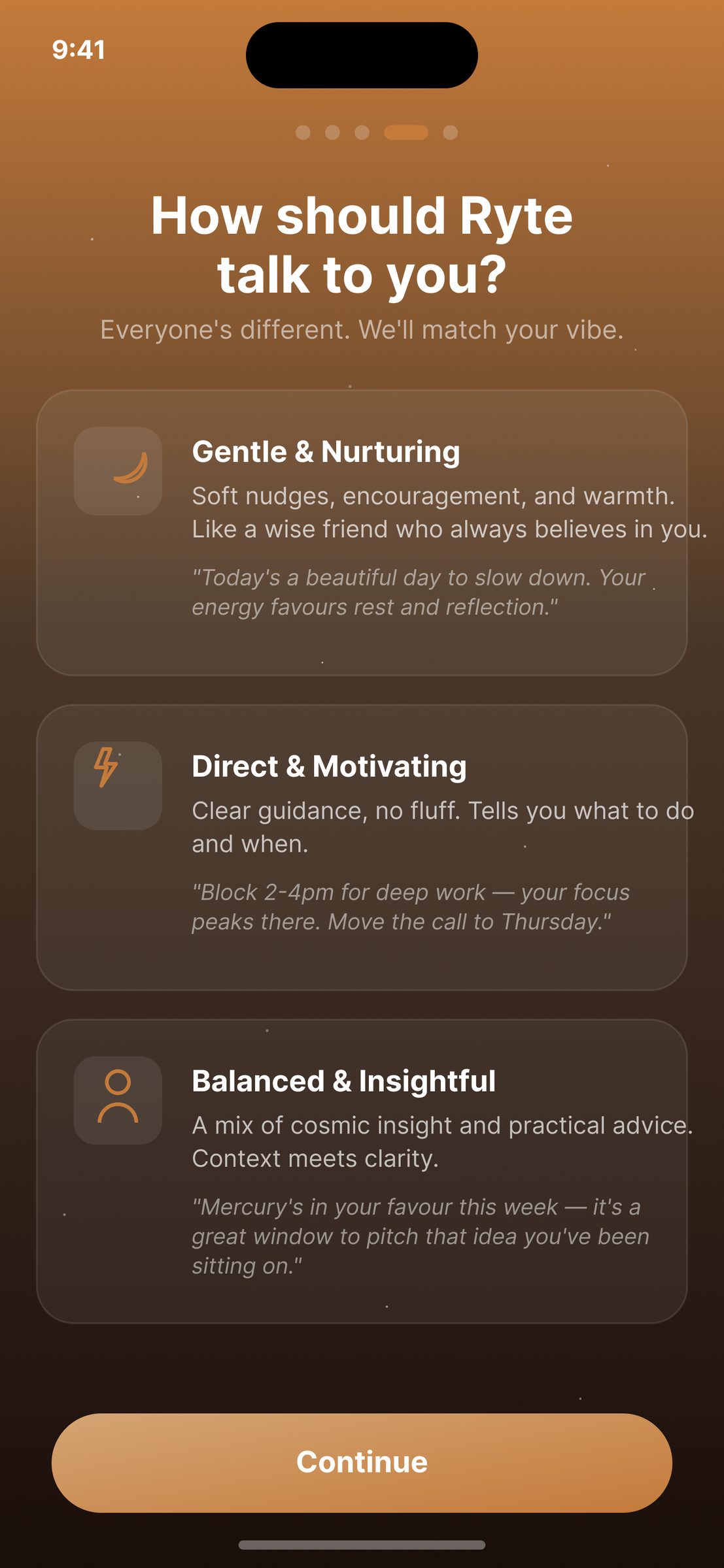
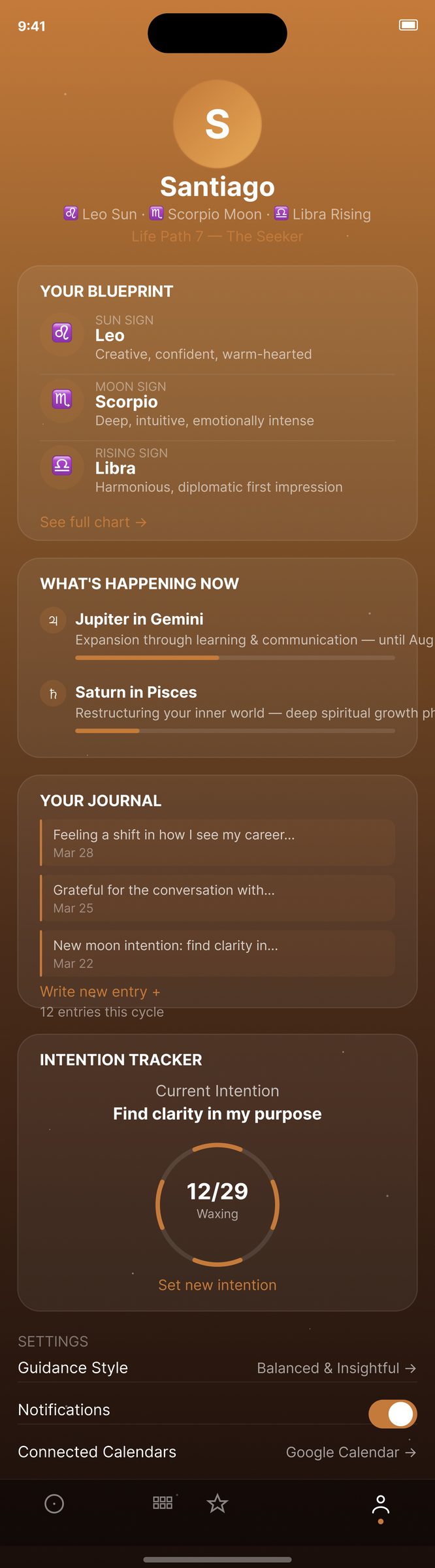
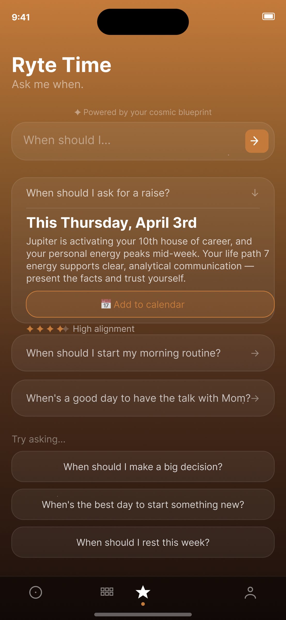
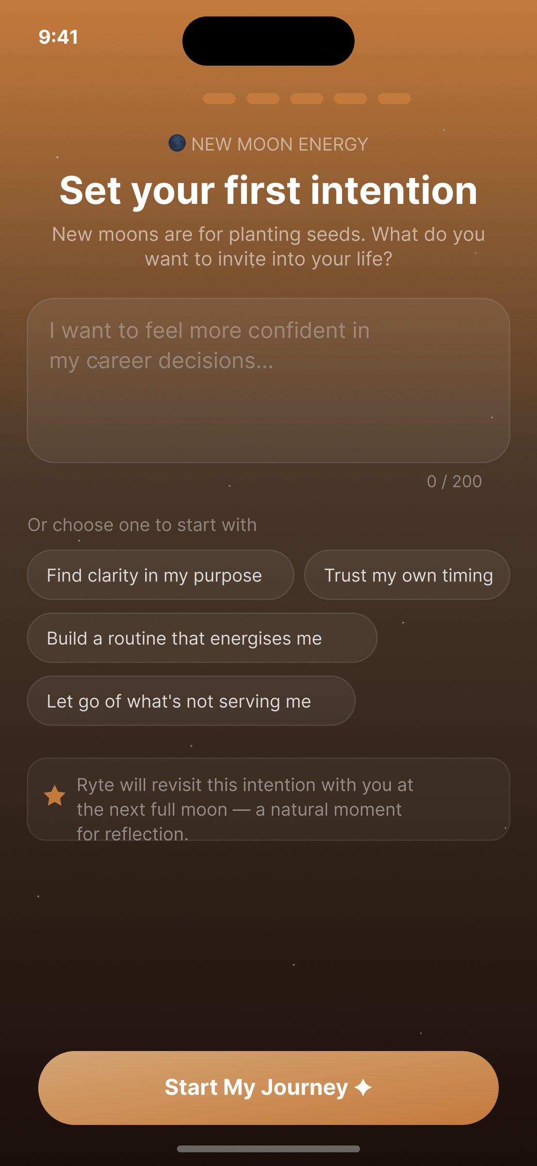
Ryte reads as a calm daily companion first, an astrology app second. The people who open it aren't checking whether Mercury is retrograde; they're sitting for a minute before the day starts. Journal, breathe, pull a card, notice the phase. The sunrise palette resets the mood every time the app loads. The astrology gives the ritual its structure. The wellness is the meal.
Ryte taught me how much work a colour palette can do when it's chosen with intent. The sunrise gradient isn't decoration; it's the app's whole thesis compressed into pixels. Warmth as an invitation, evolution as a daily prompt, sanctuary as a mood.
Next version: a paired haptic breathwork session, a native watch companion, and more custom line illustration replacing the placeholder iconography. The palette earned its keep. The category framing (a wellness app that happens to include astrology) is the thing I'd protect at all costs.

Open to full-time roles, freelance briefs, and slow coffee chats.